A brand campaign photograph starts being taken long before the shutter clicks. A behind-the-scenes look at a day on set explains the difference between a "nice product photo" and an image that sells.
Before the shoot: translating the brief
The brand tells you "premium but warm". Translating that sentence into light, colour and framing is the photographer's job. Premium: controlled light, clean background, ordered composition. Warm: natural textures, slight looseness, a human hand in frame. The shoot plan comes out of this translation — moodboard, lighting scheme, shot list.
On set: controlled chaos
Shooting food, you race the kitchen: steam dies in 40 seconds, cocktail ice melts in 2 minutes. For a burger bite shot, three backup products stand ready. Automotive is the opposite — the car is patient but the sun is not; the reflection window opens twice a day, and if you miss it you come back tomorrow.
The most expensive thing on set isn't equipment — it's time. Preparation is improvisation's insurance.
The lighting scheme: a product's character
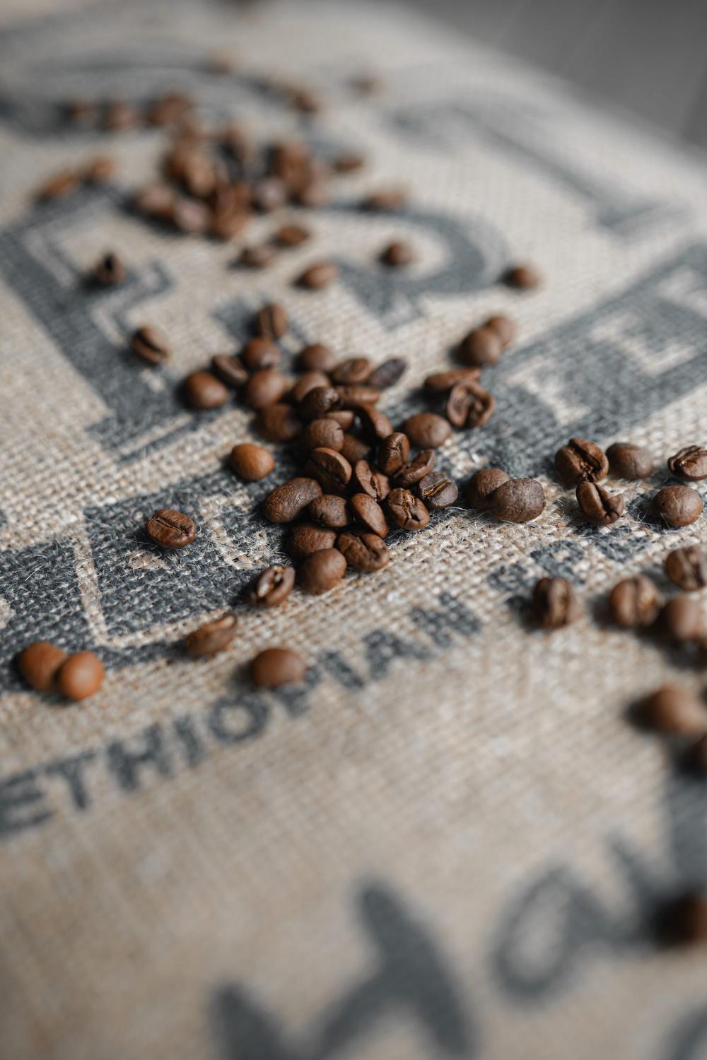
Every product has a "good side". Steam on a coffee cup comes from a backlight; packaging texture lives in side light; a backlight makes cocktail glass glow. The lighting scheme is built around the product's character — not from a template.
After the shoot: selection and consistency
Twenty frames are chosen from five hundred. The criterion isn't "most beautiful" but "most consistent with the campaign's language". Colour grading settles into the brand's palette rules; all the images of one campaign should look like they came from a single hand.
If you're curious about the back of the set on your next campaign — ask, I'll tell you. Better: come and watch.
Let's write this story together.
Send your date and the mood you imagine — I'll reply within 24 hours.
Get in Touch