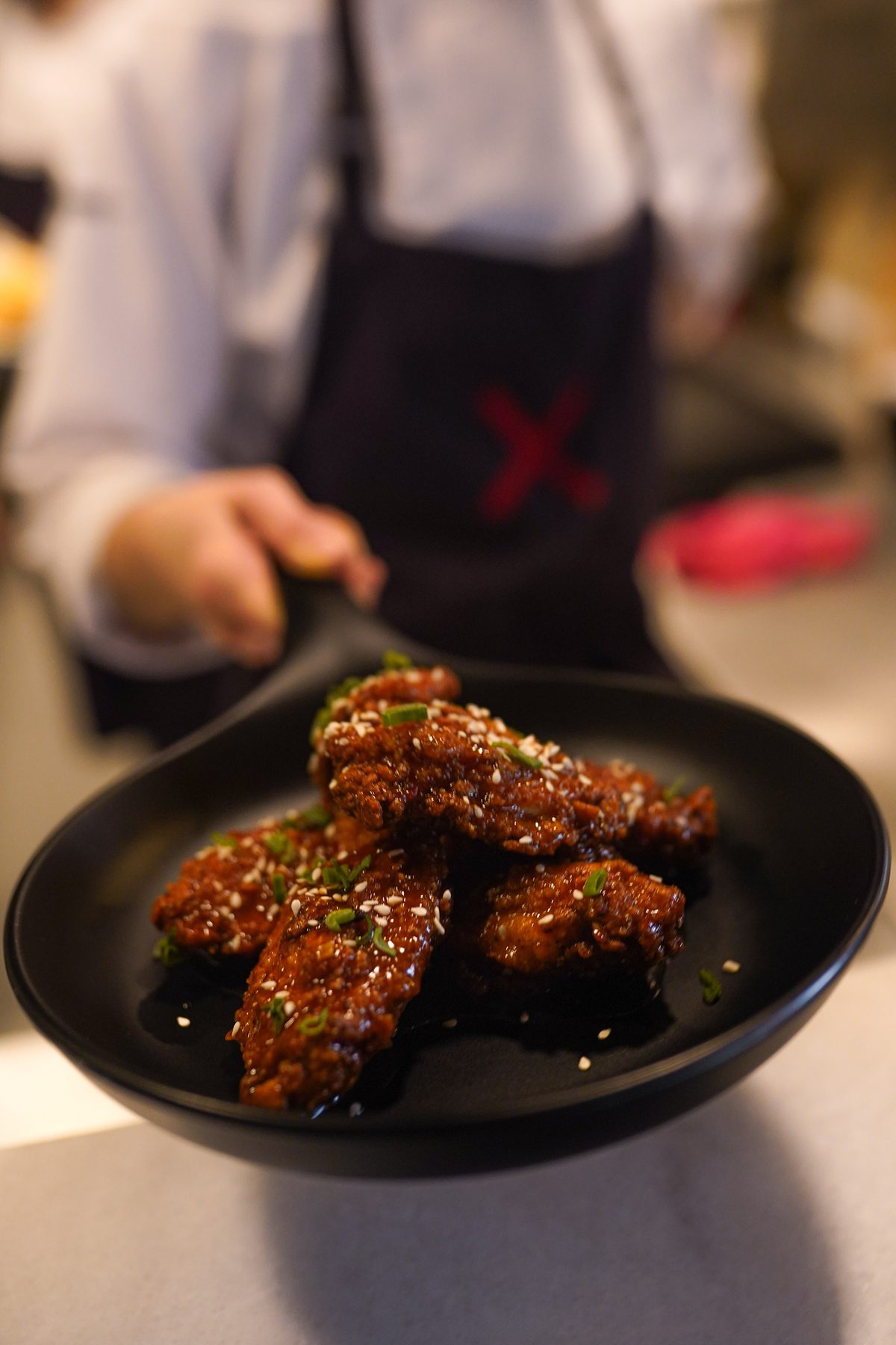
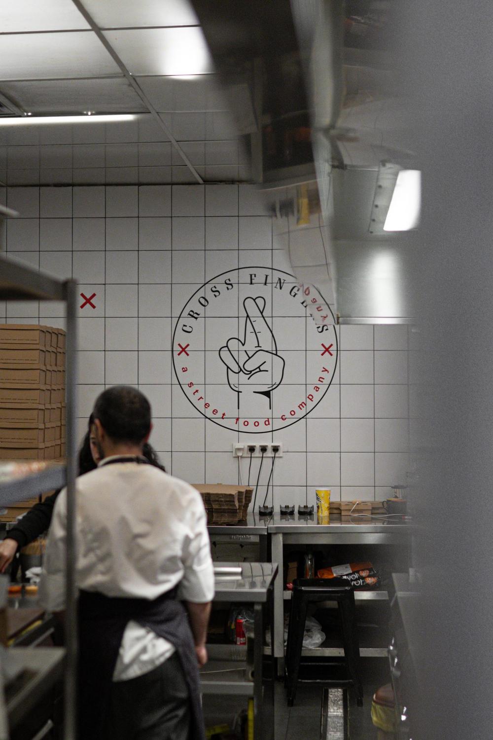
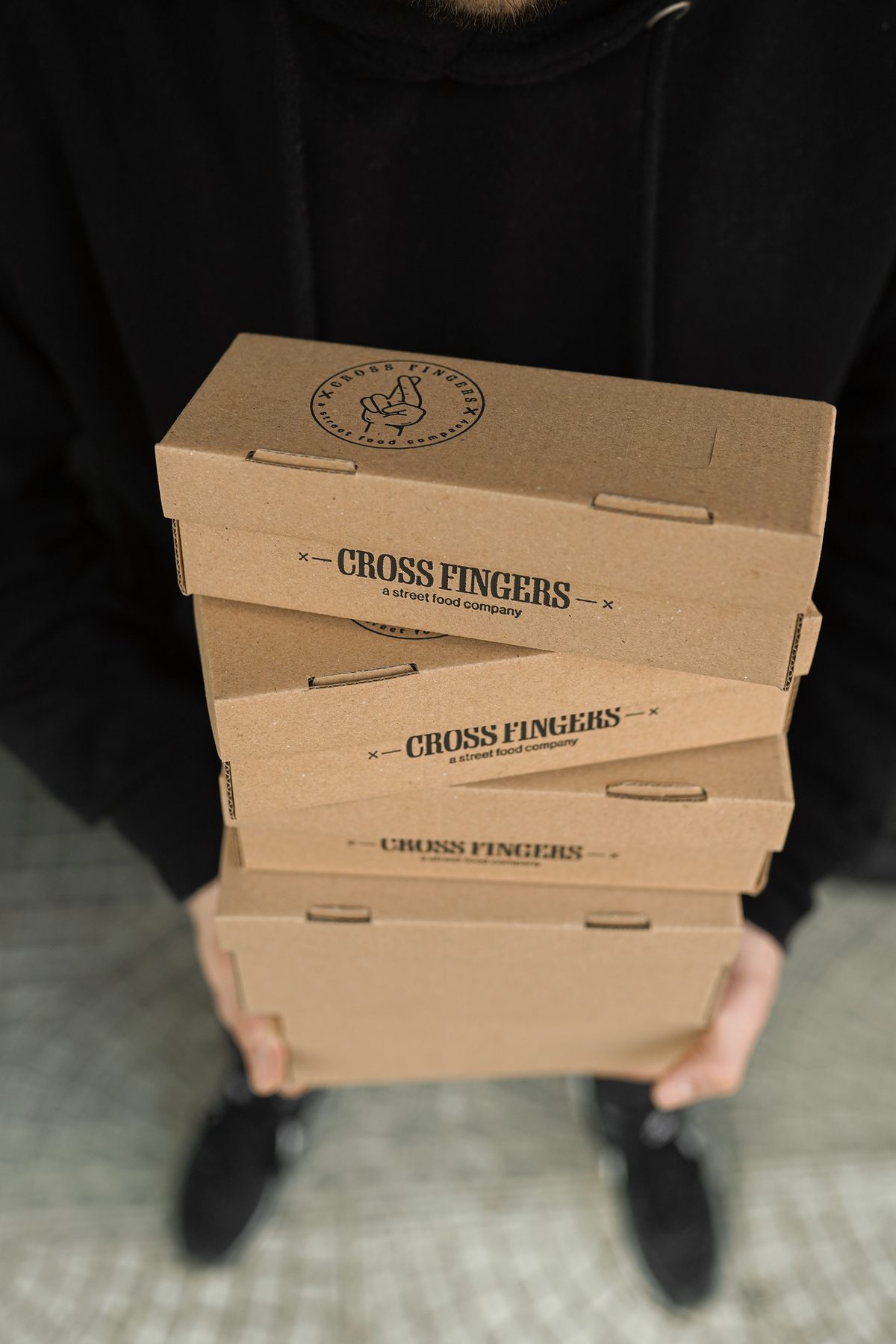
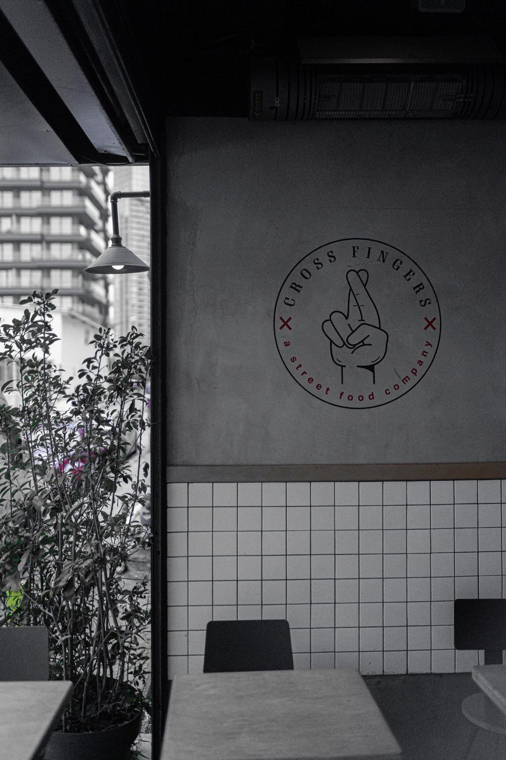
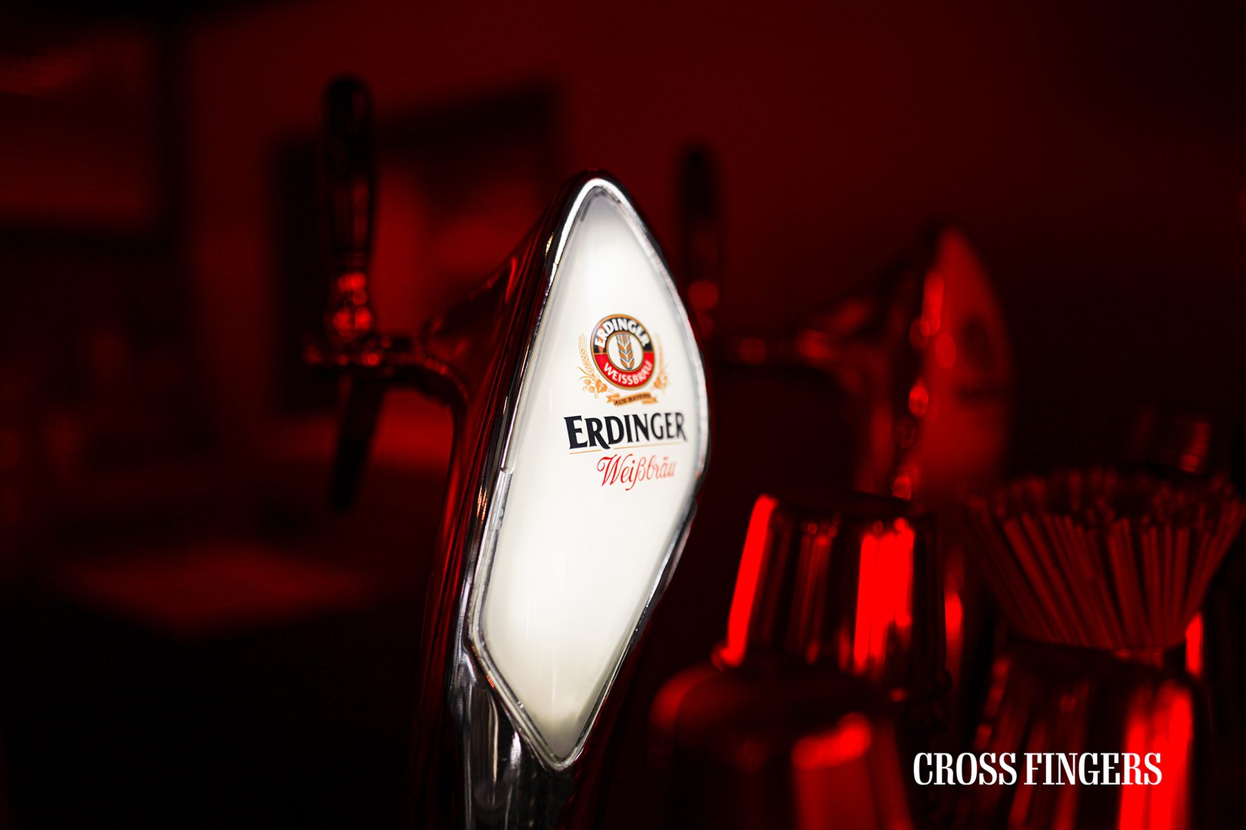
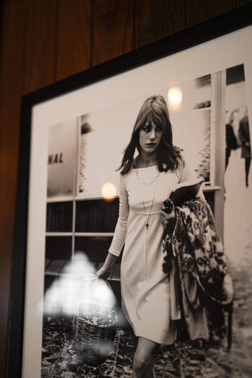
CrossFingers isn't an ordinary client for us — it's a long-term, trust-based partnership where both sides grew each other. Carrying a smash burger brand's visual identity at the same quality across months and seasons demands a completely different discipline than a one-off campaign shoot.
How do you run a long-term brand shoot?
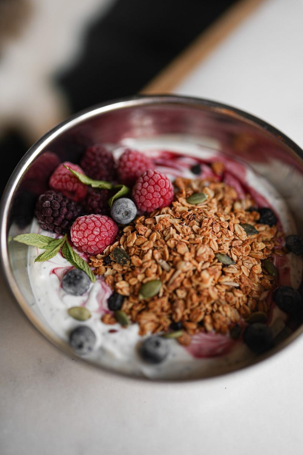
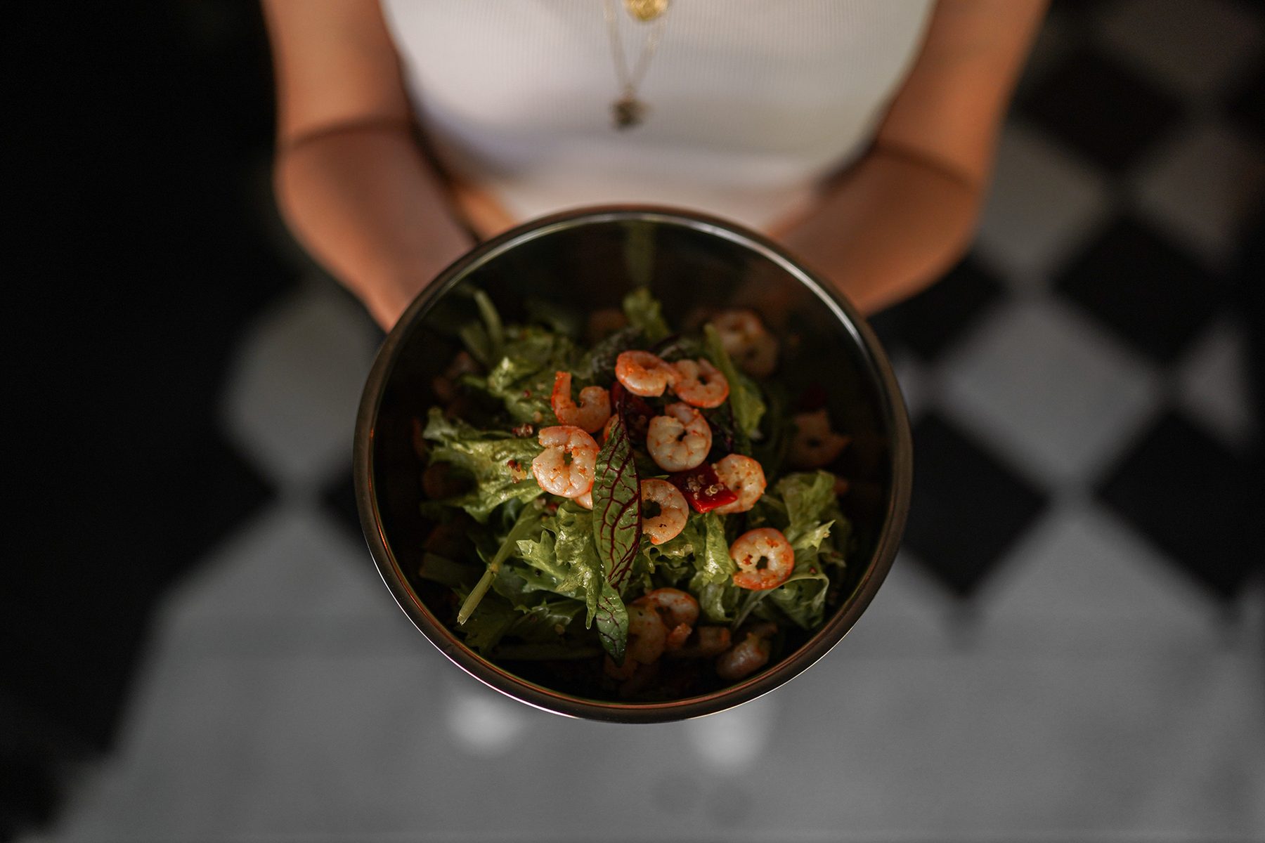
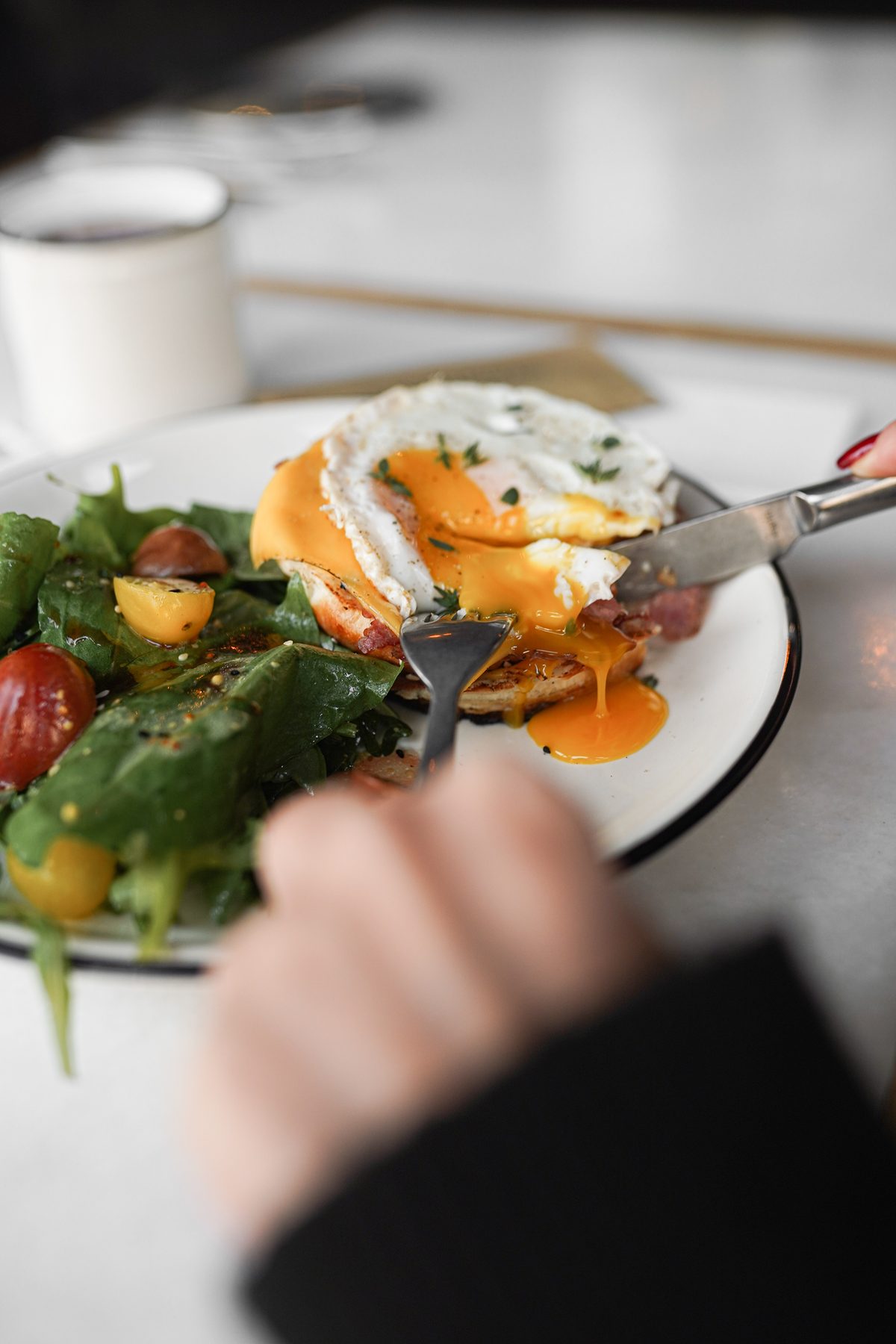
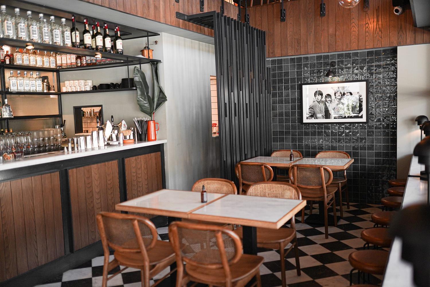
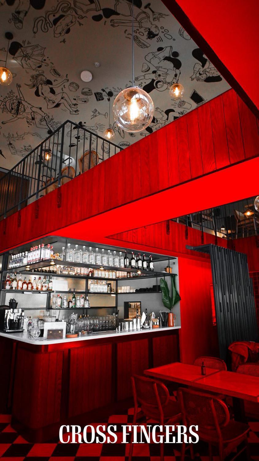
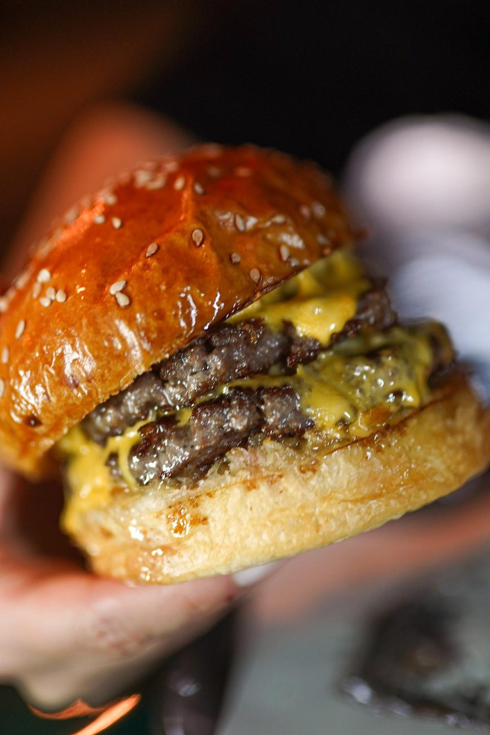
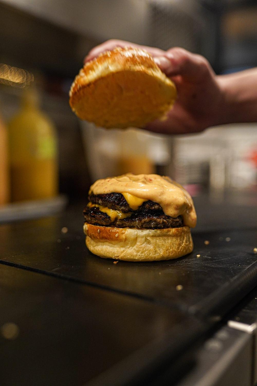
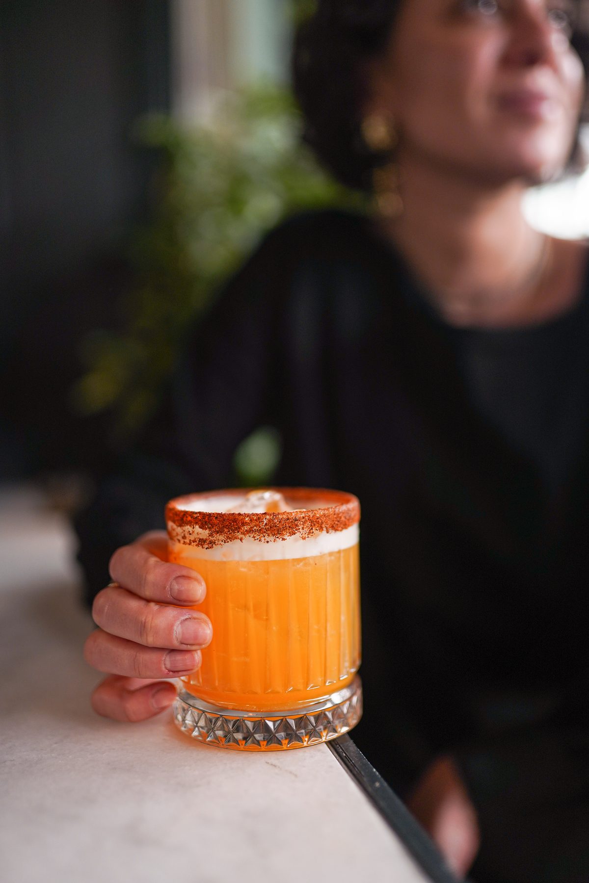
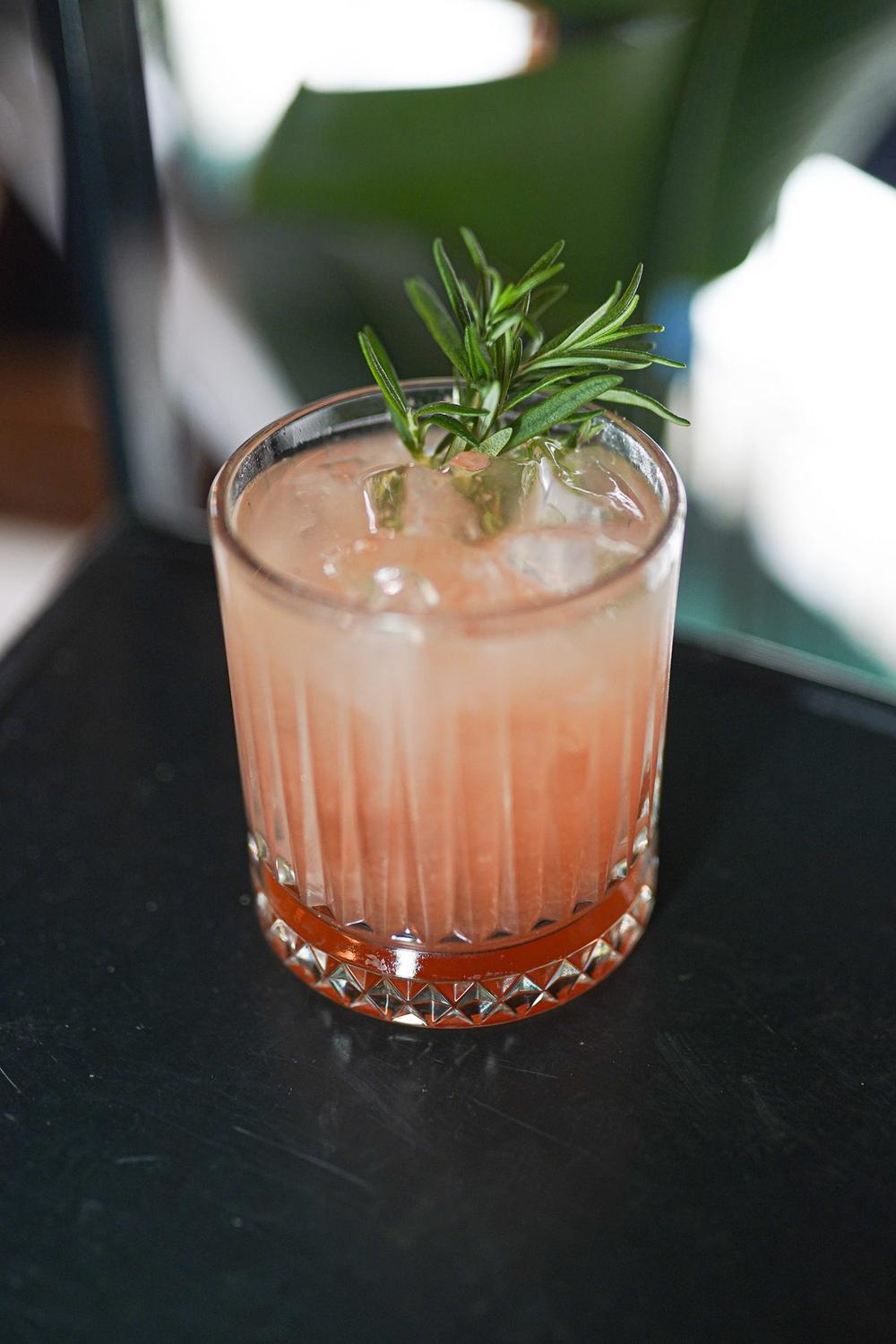
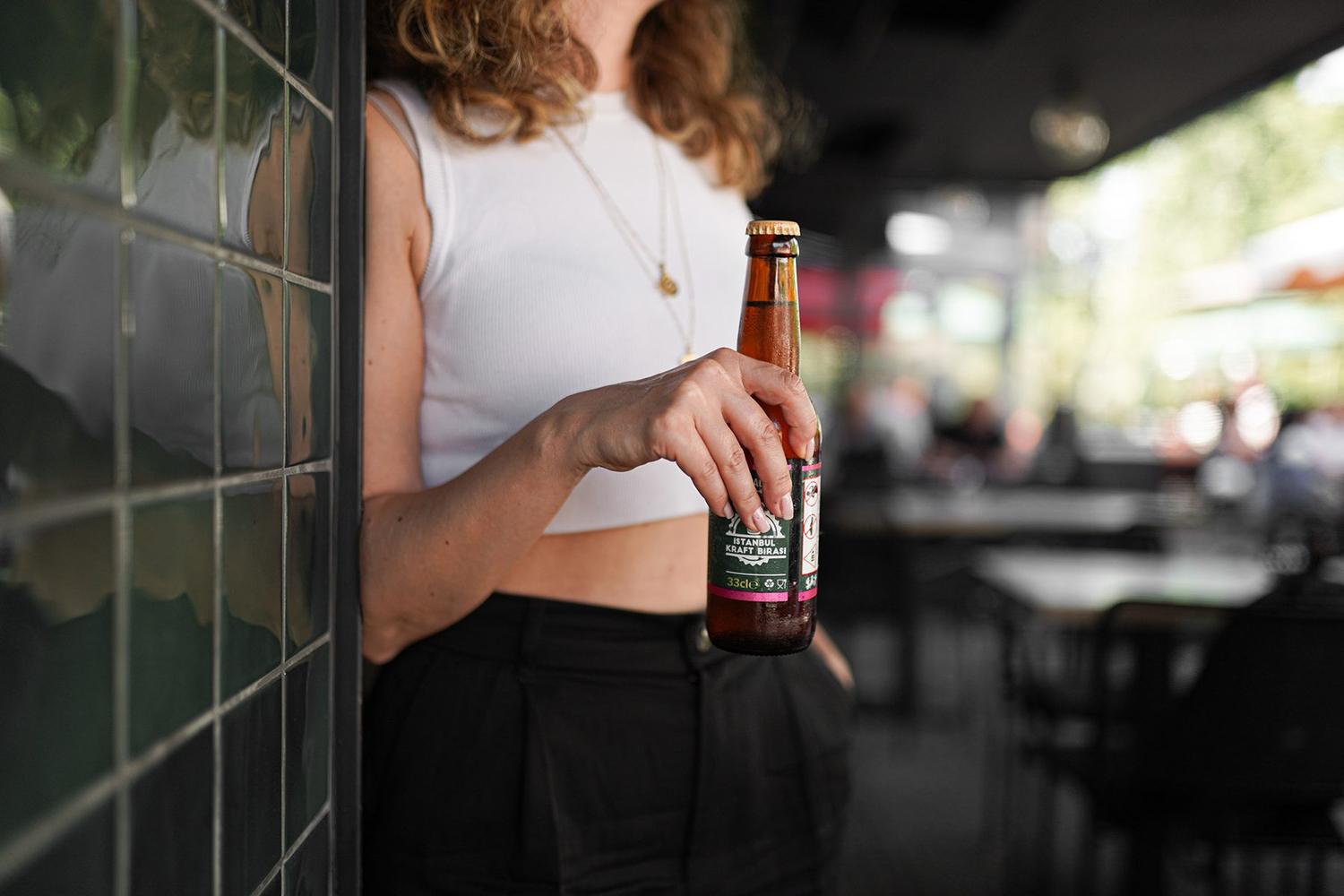
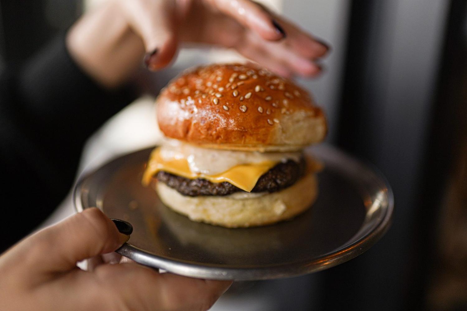
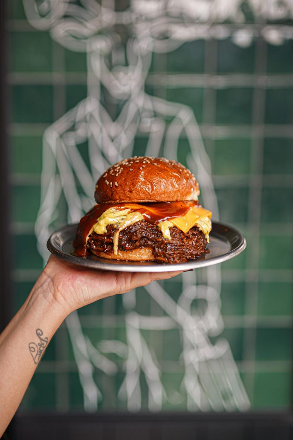
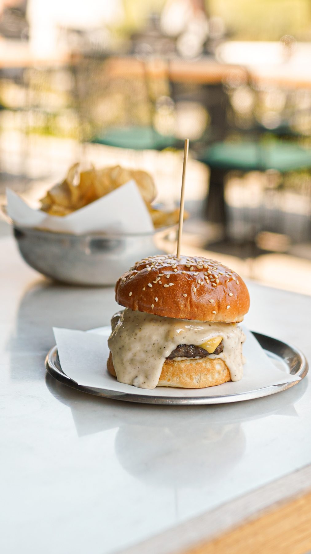
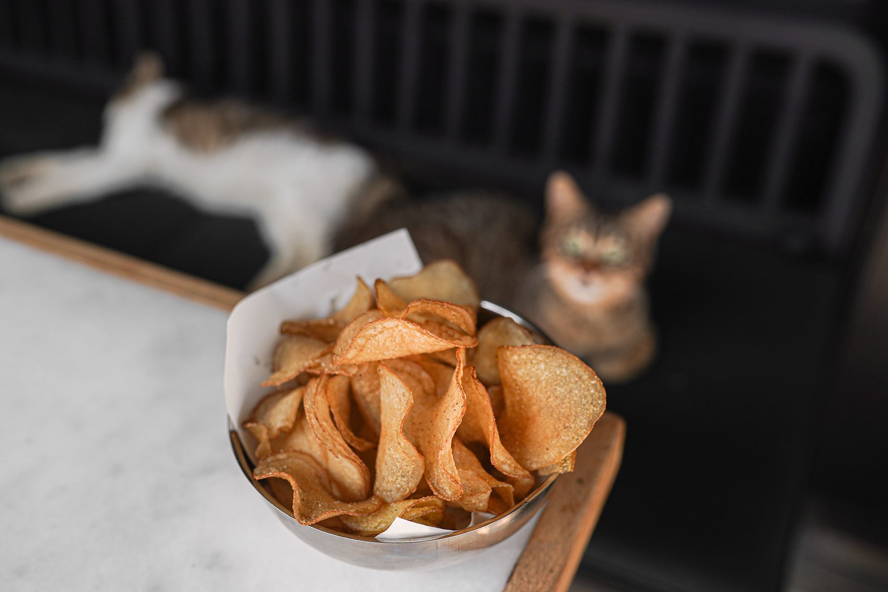
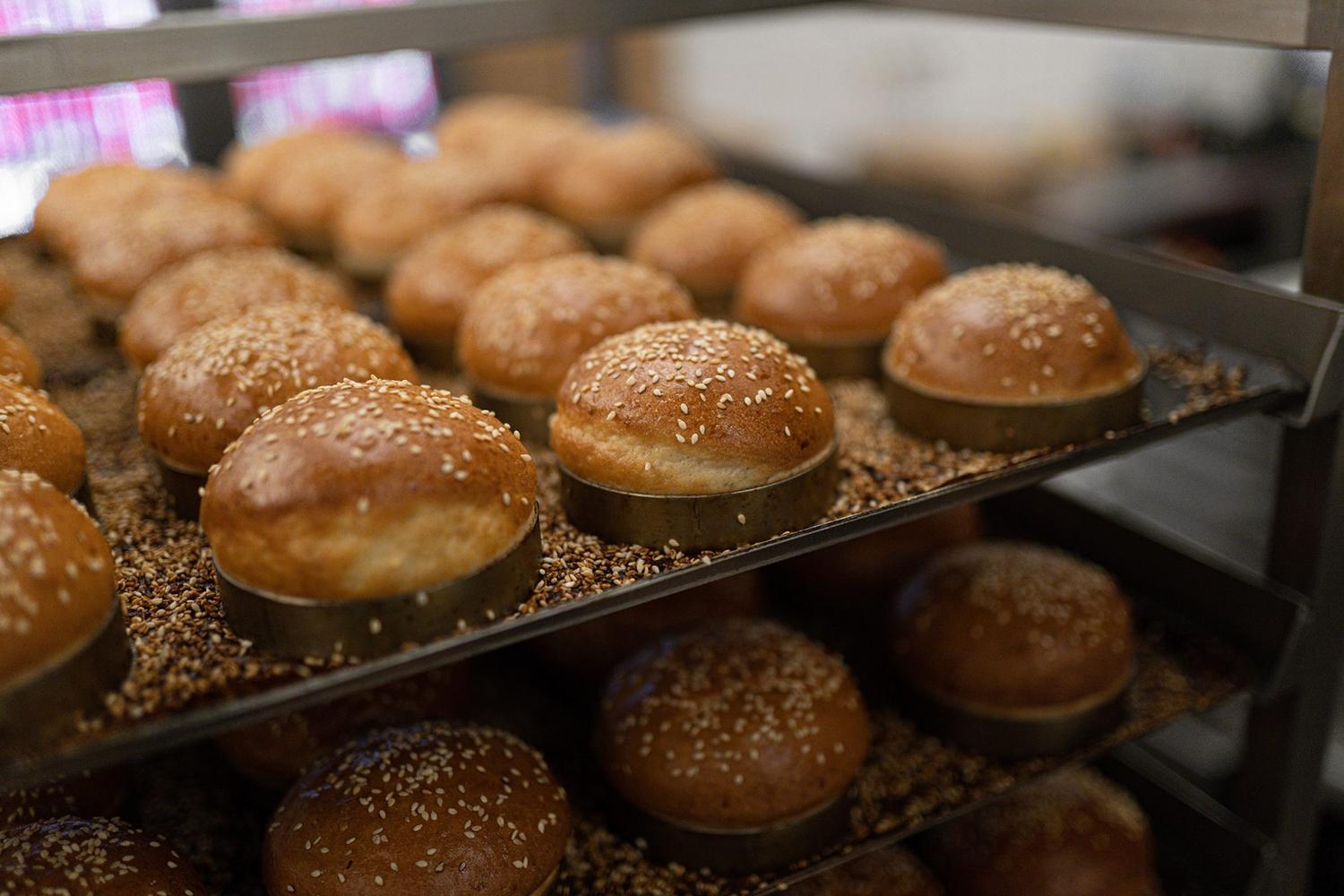
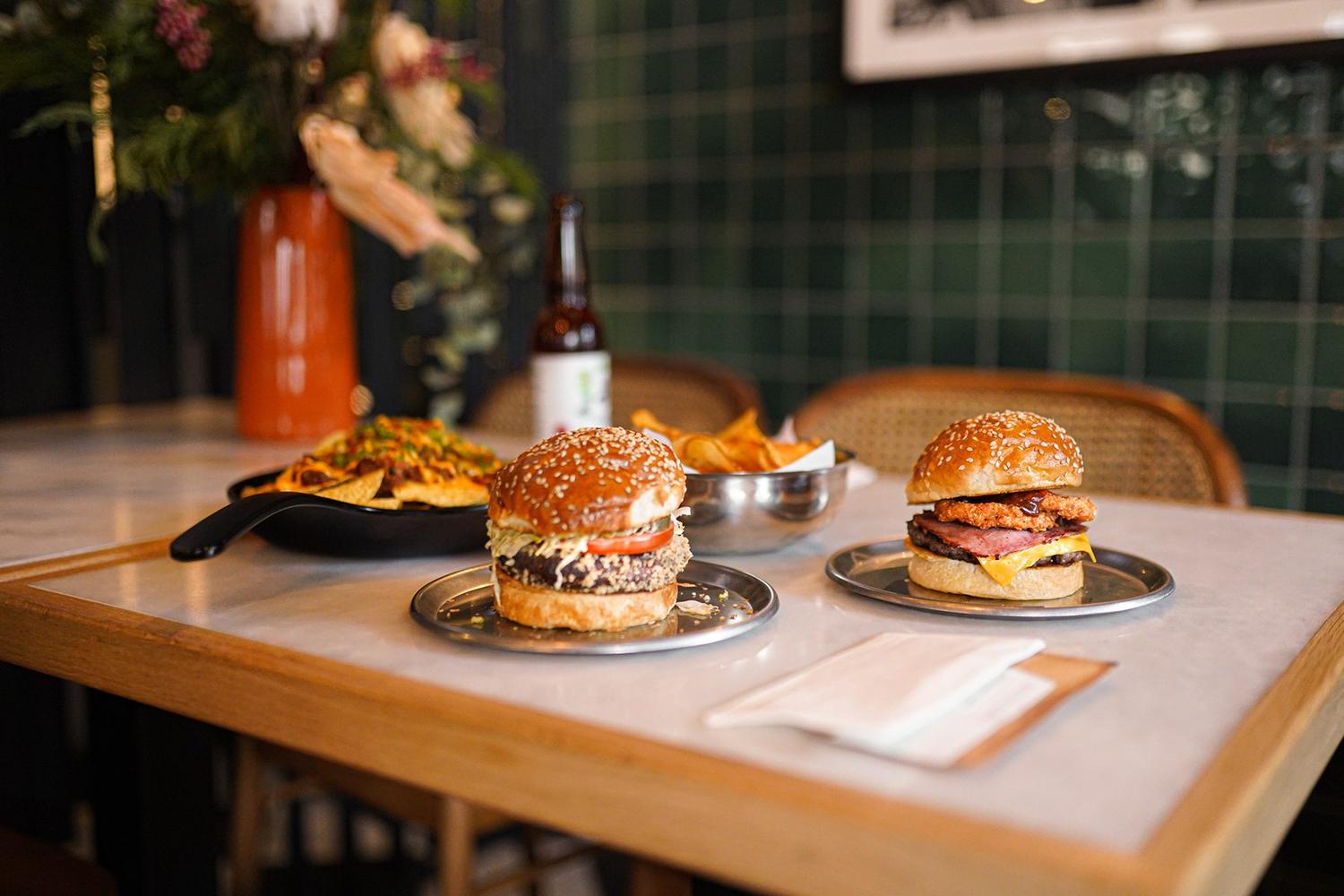
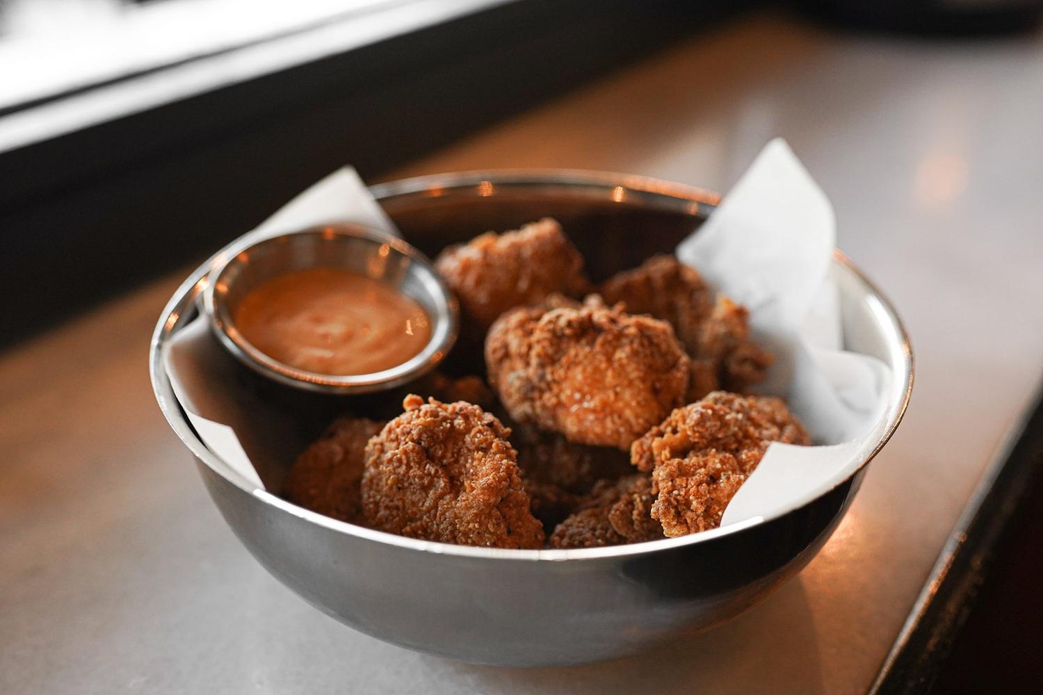
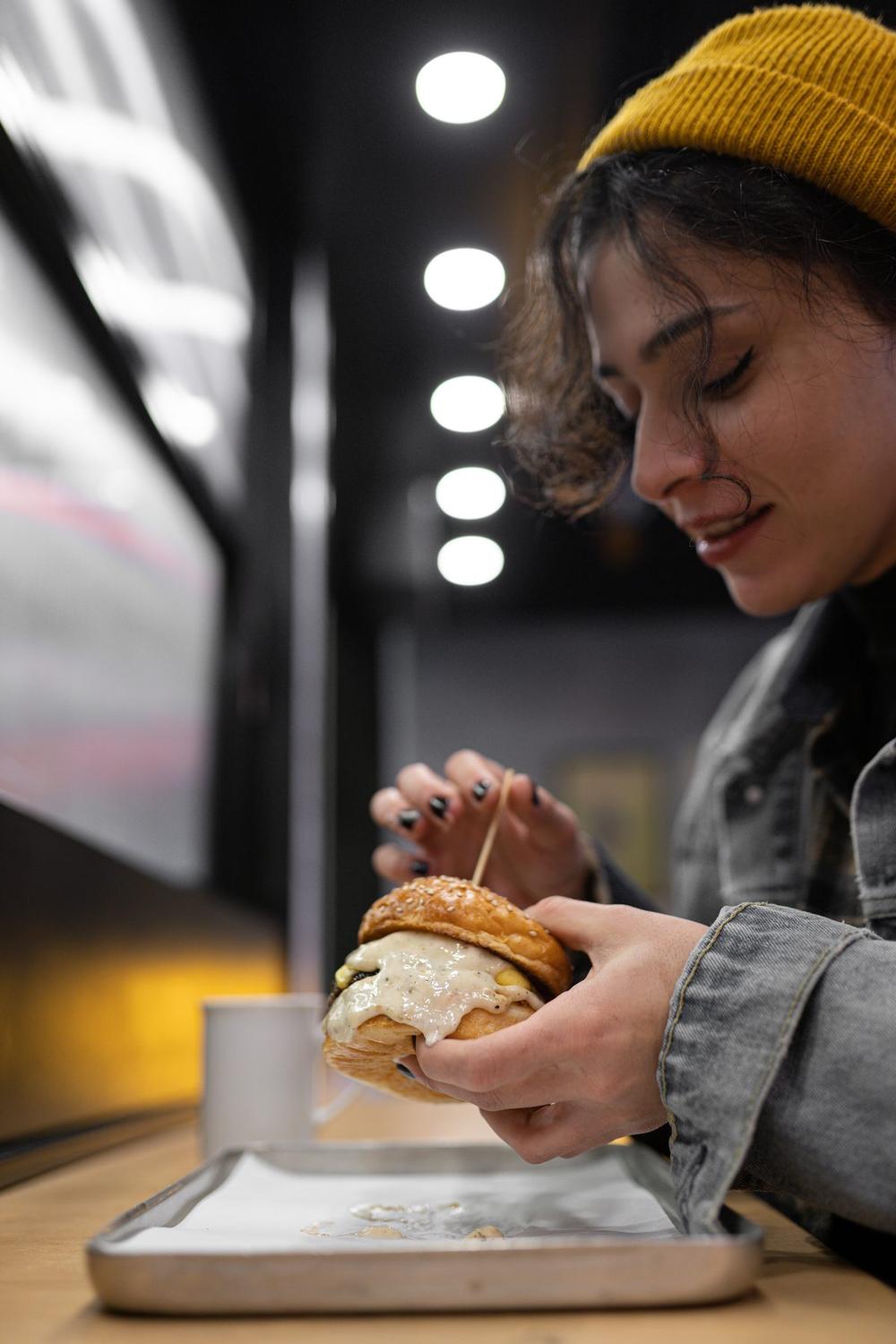
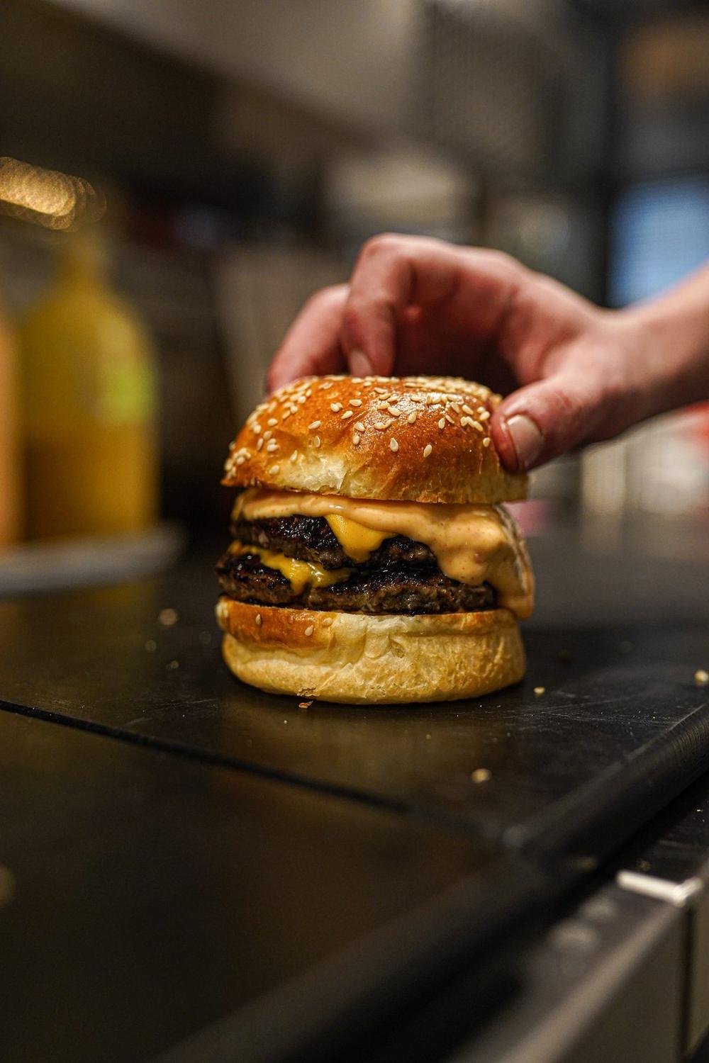
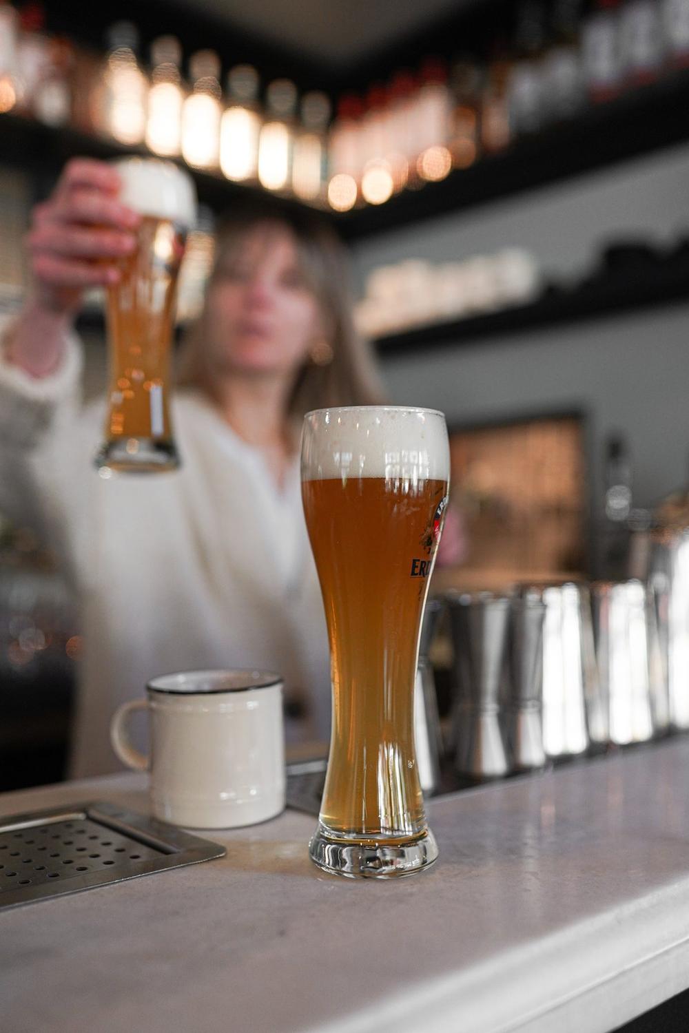
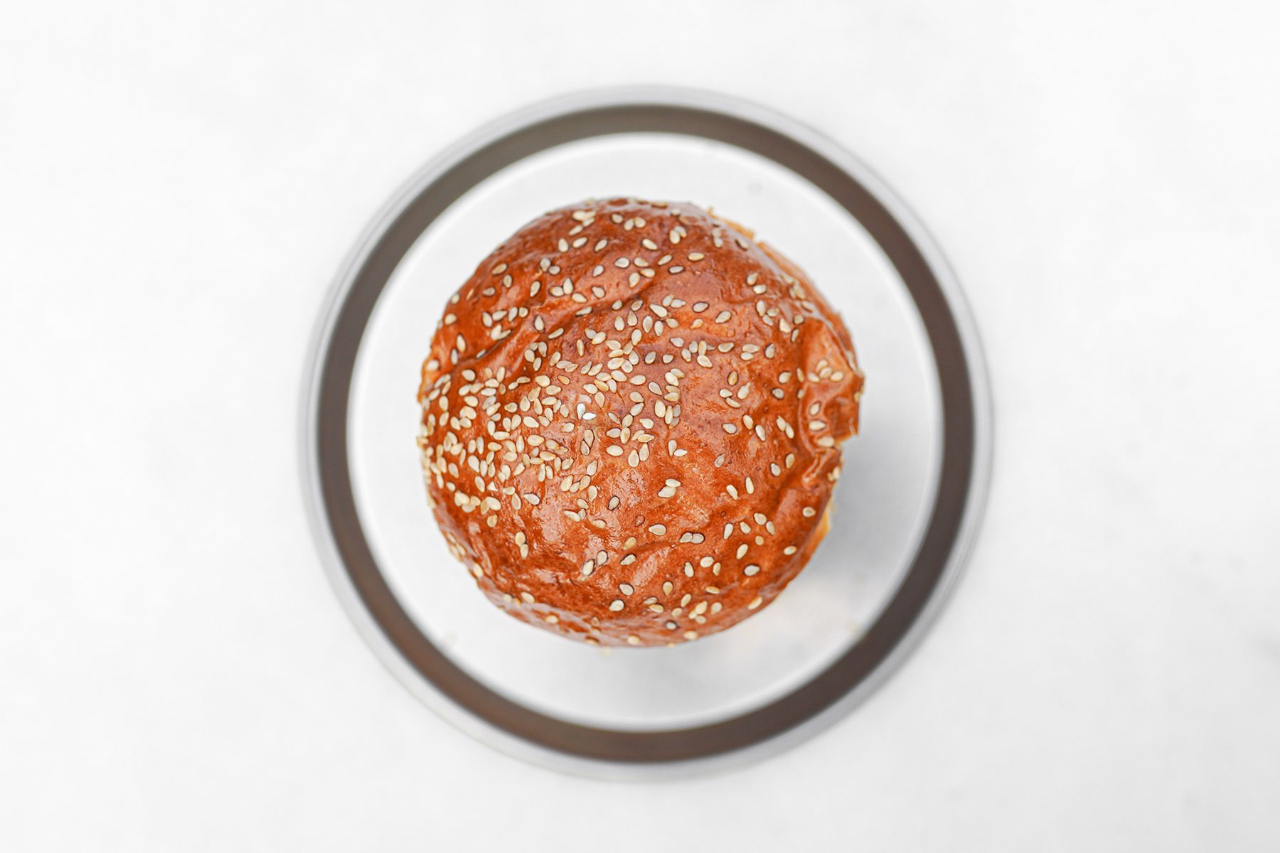
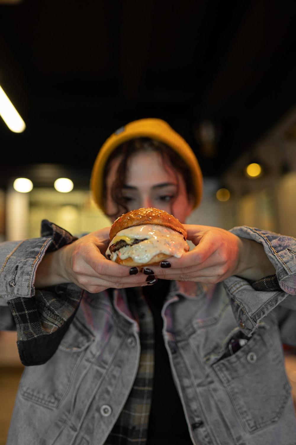
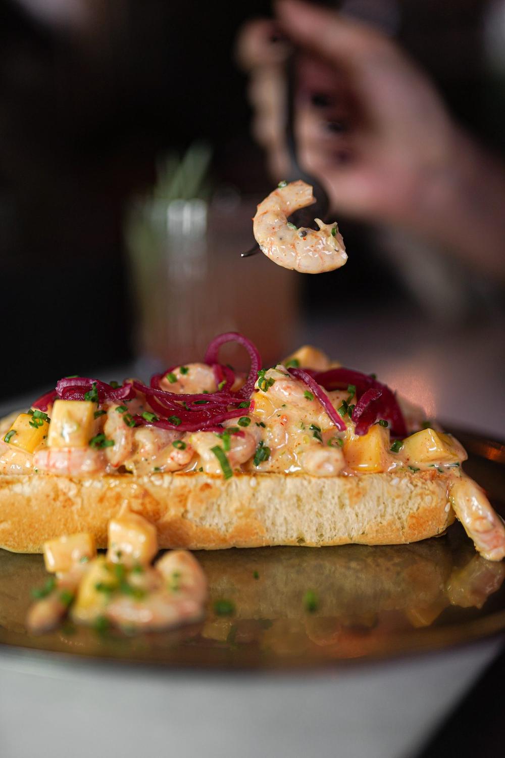
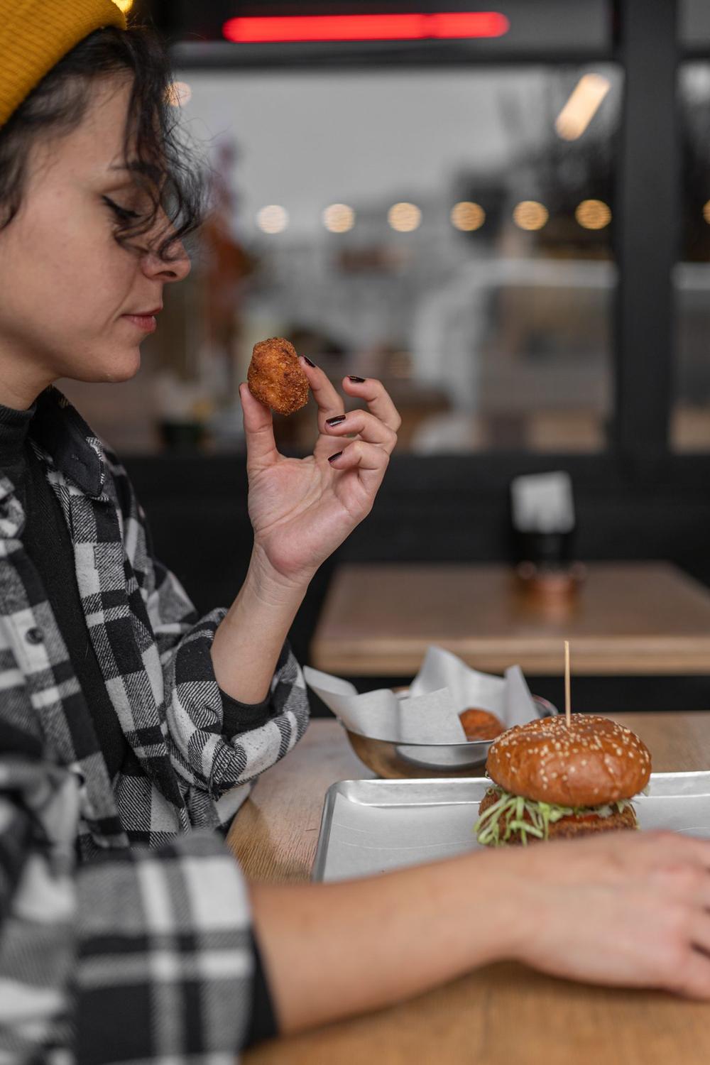
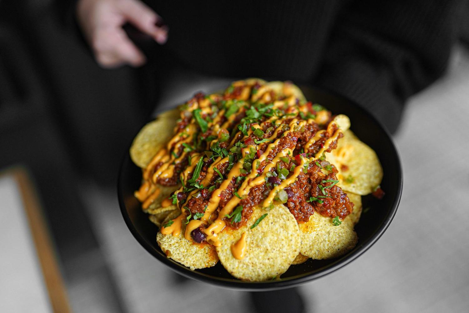
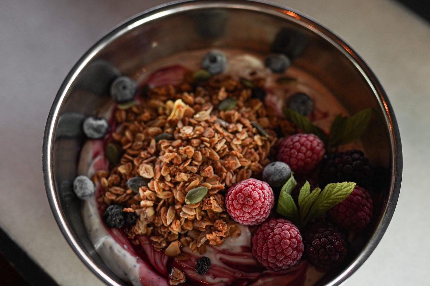
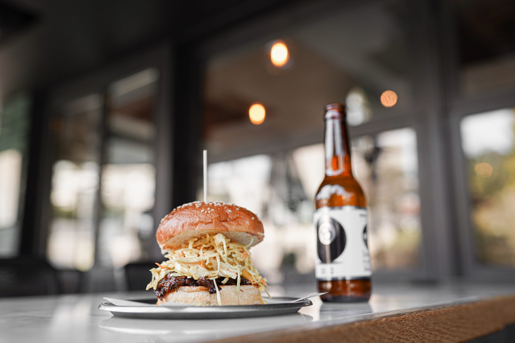
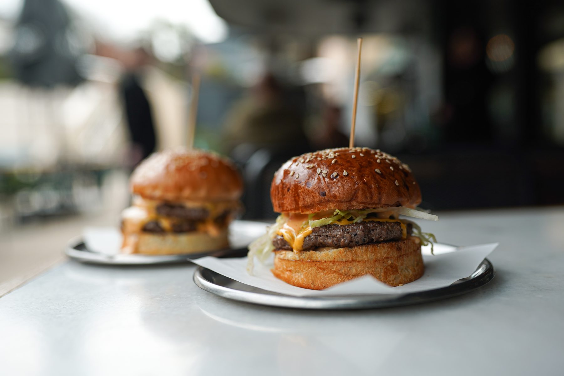
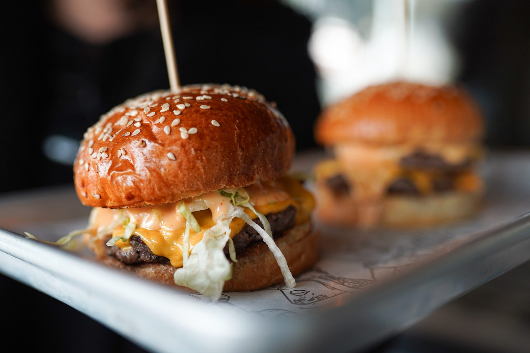
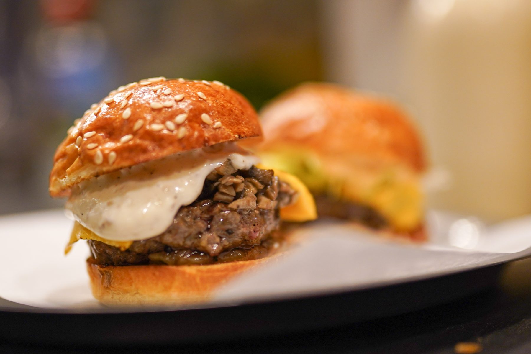
A single shoot is a sprint; a brand partnership is a marathon. New content is needed every month, but the visual language must never age or feel repetitive. So we built CrossFingers a "visual constitution": a fixed palette (warm meat tones + dark ground + neon accent), a fixed texture language (fat glisten, cheese flow, the steam of the bun) and a single variable per series — the concept.
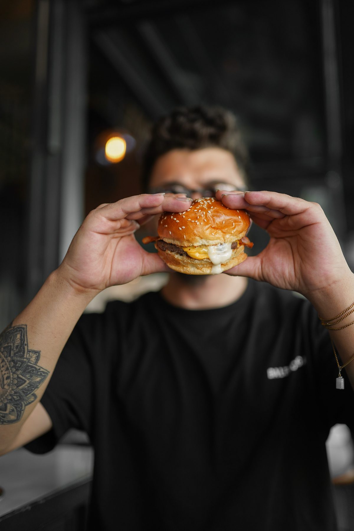
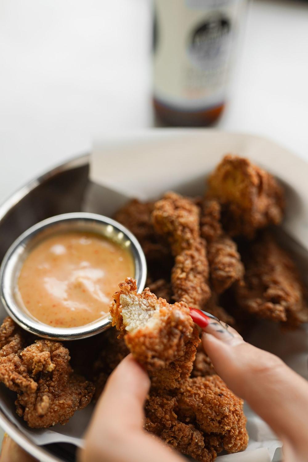
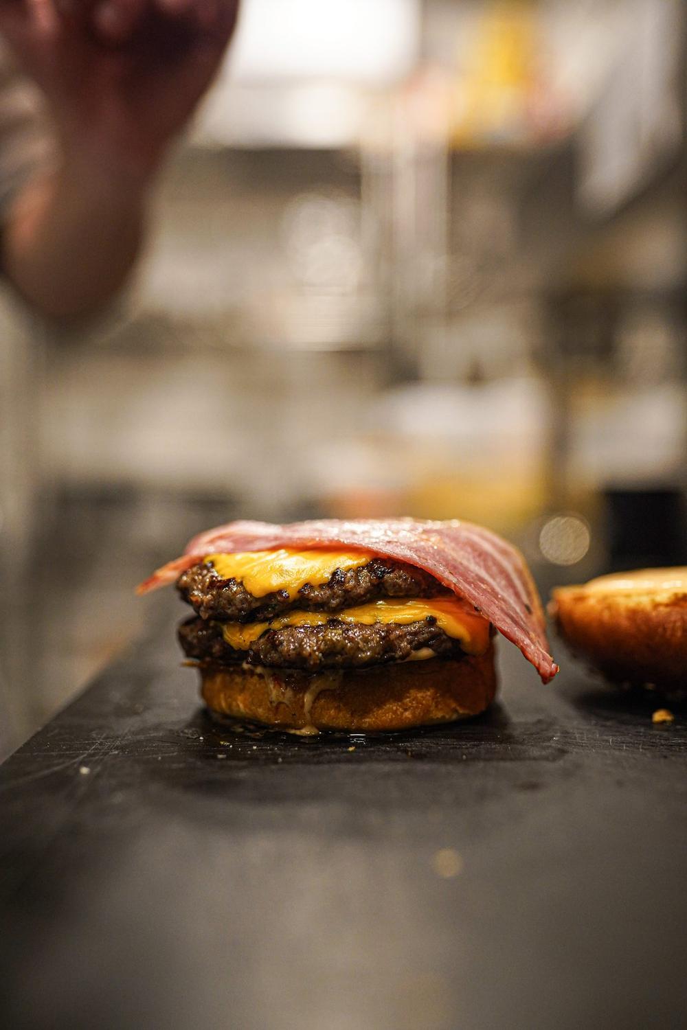
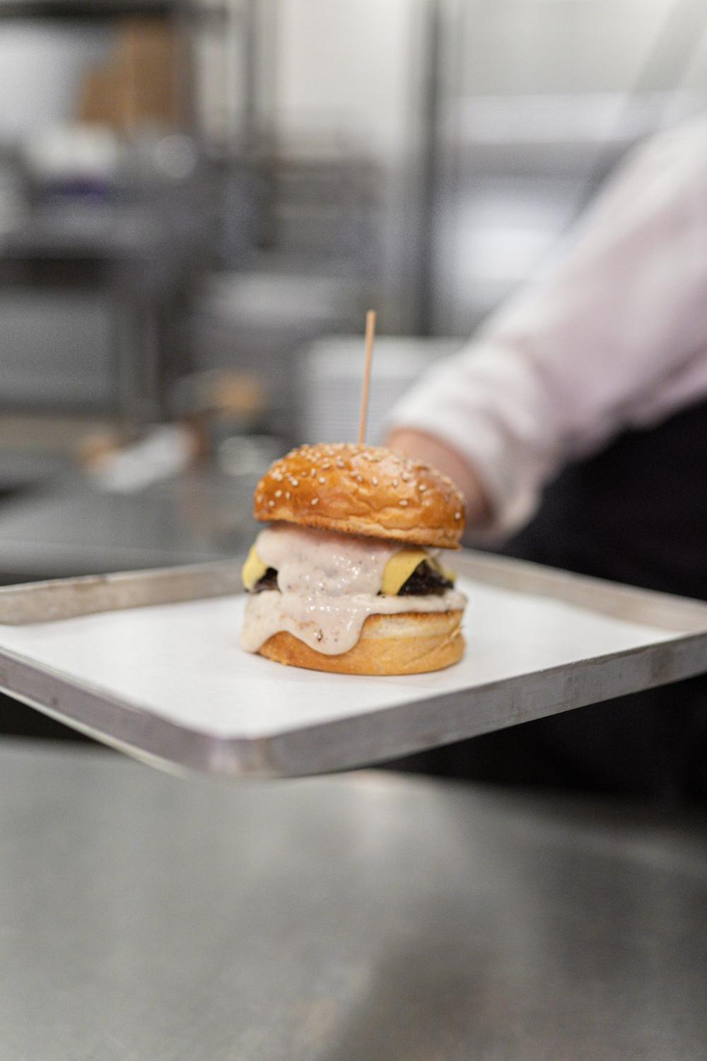
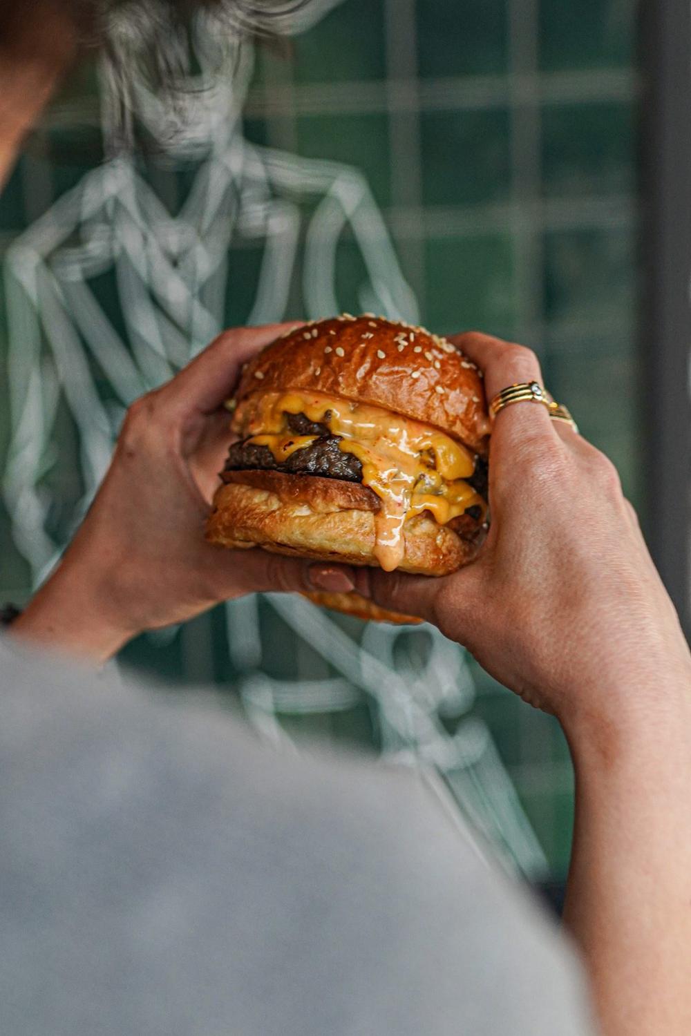
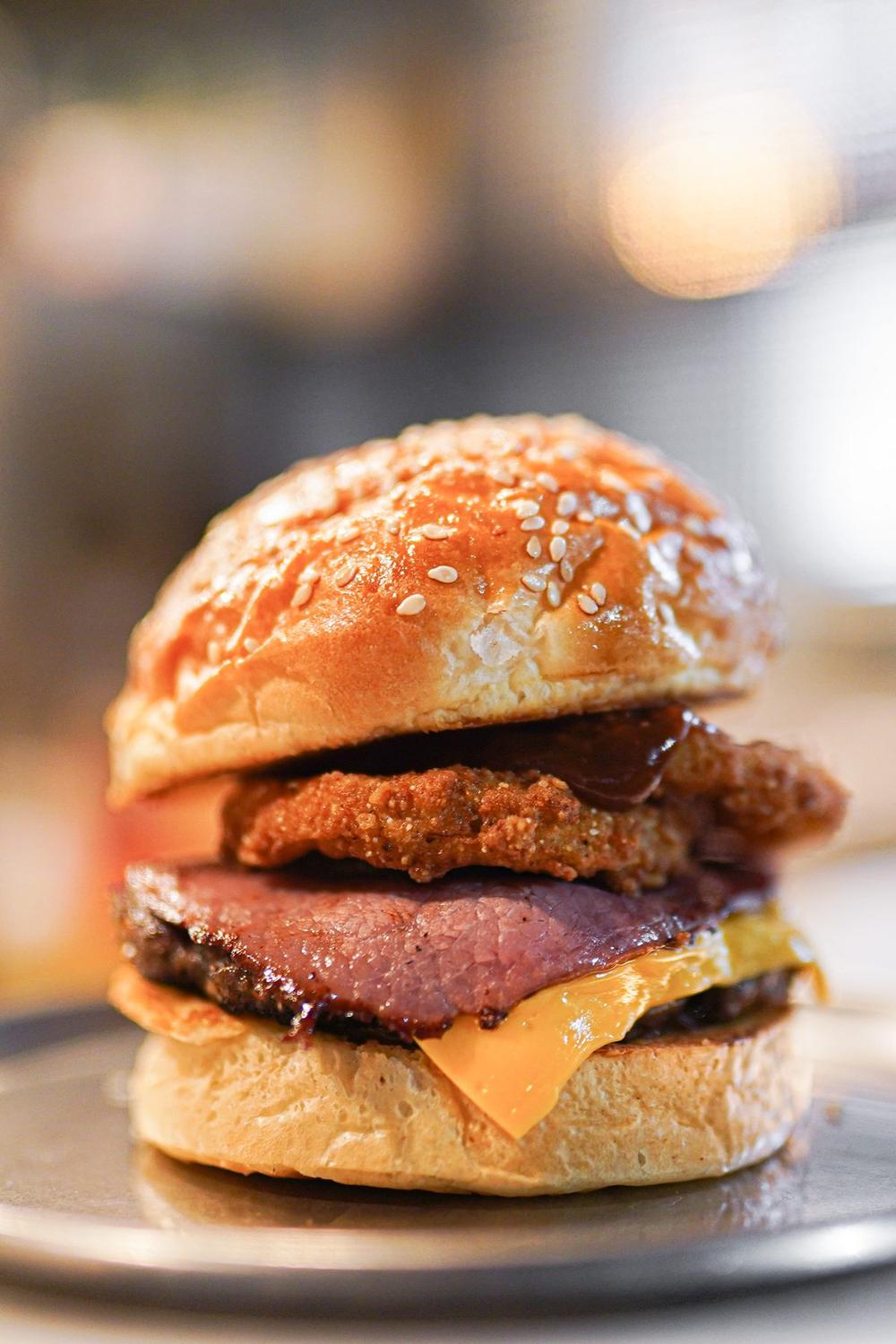
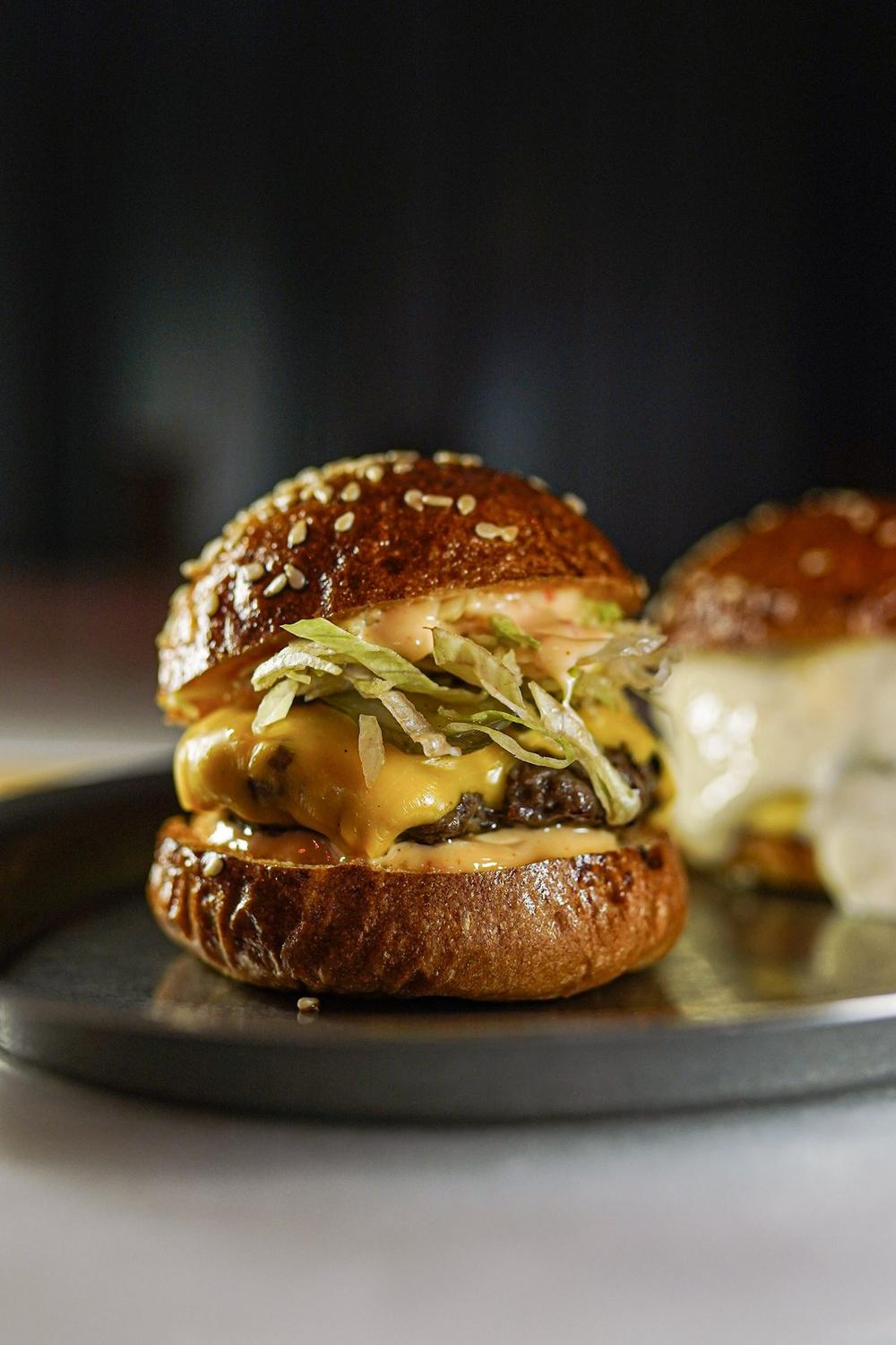
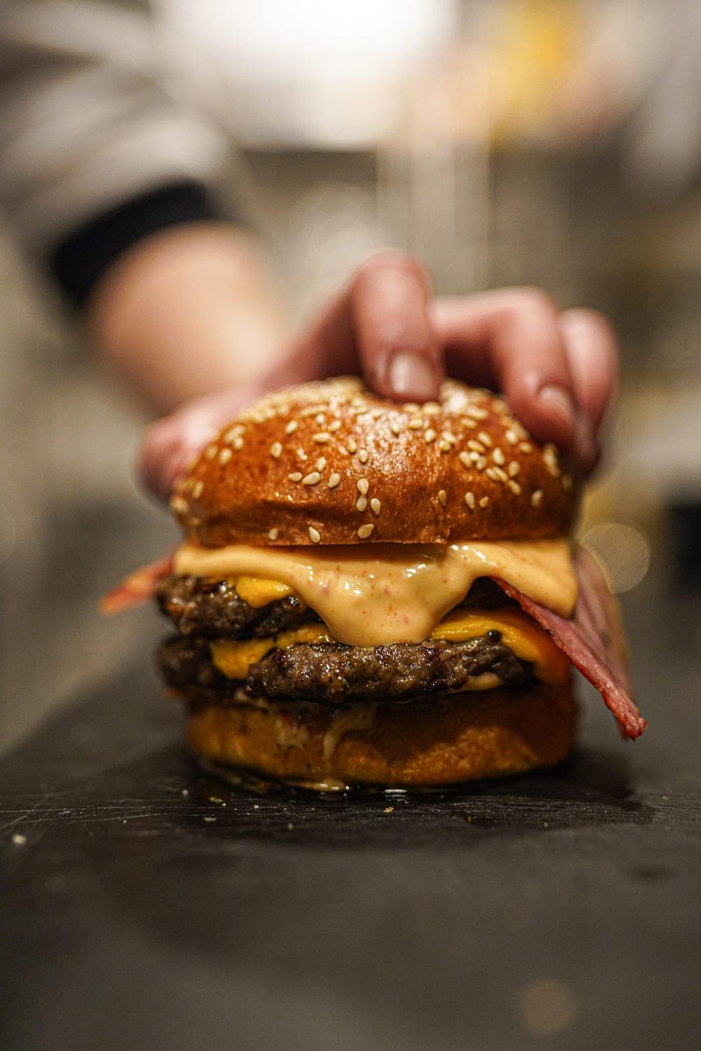
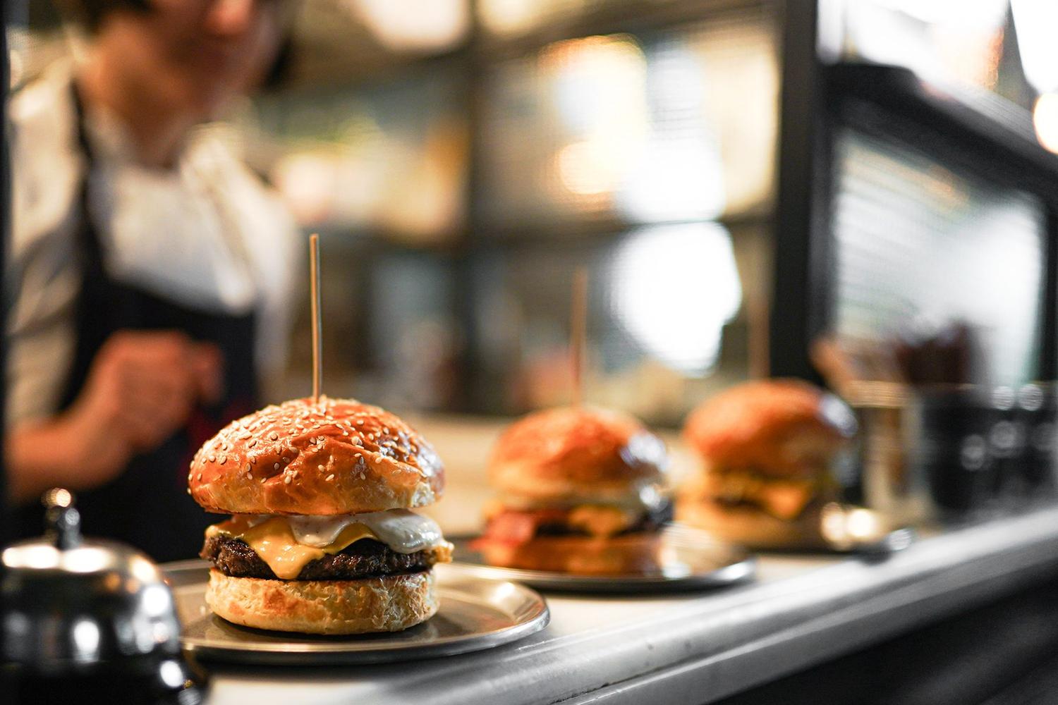
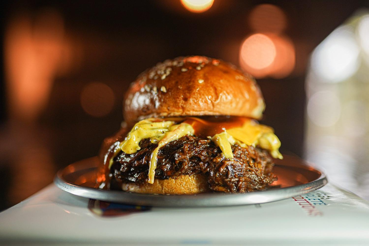
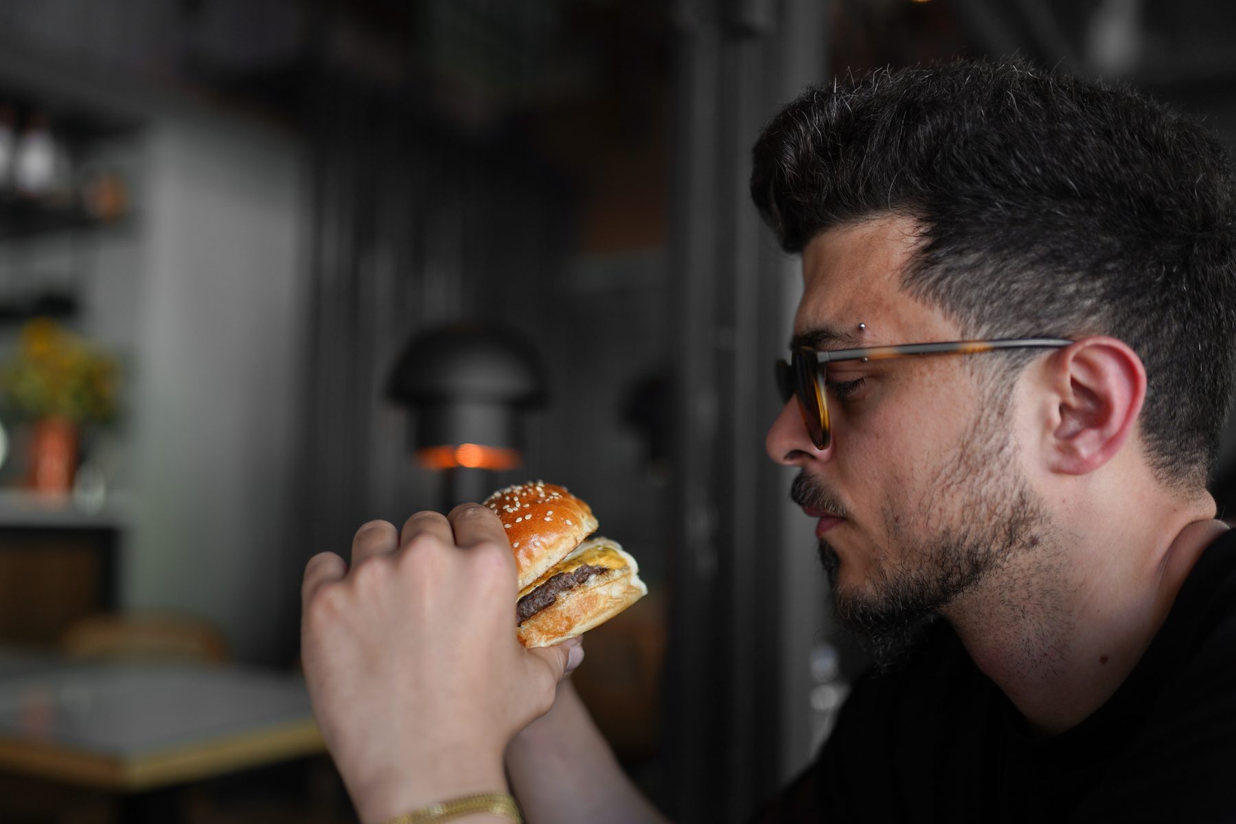
The physics of a burger shoot
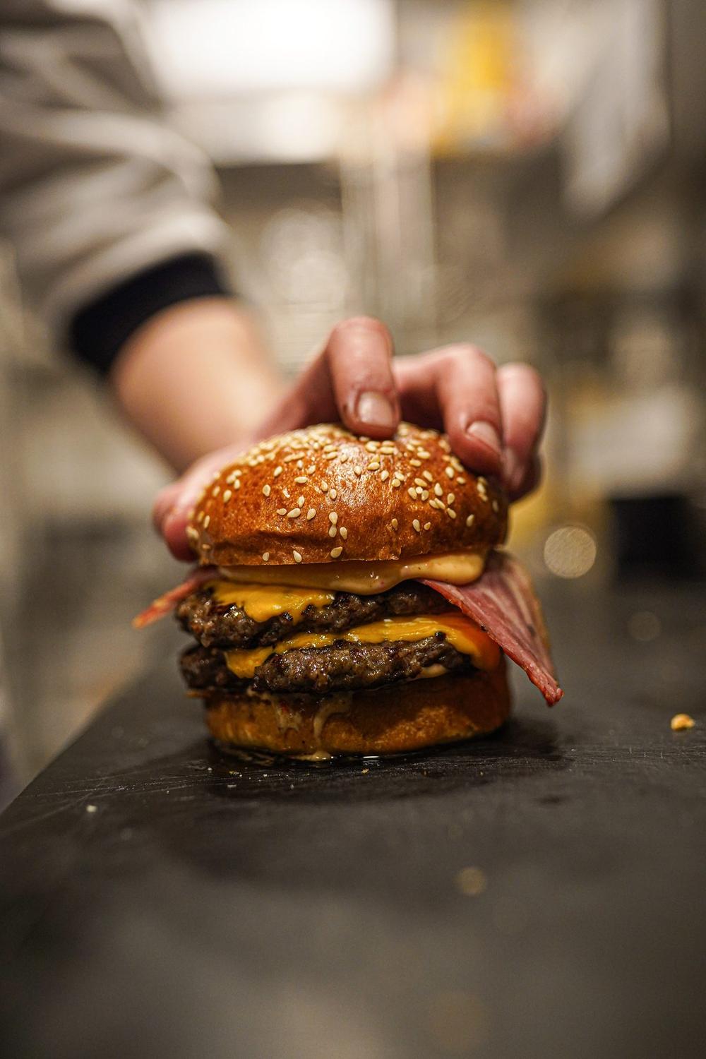
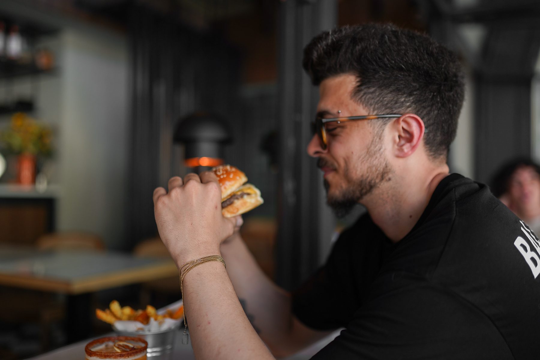
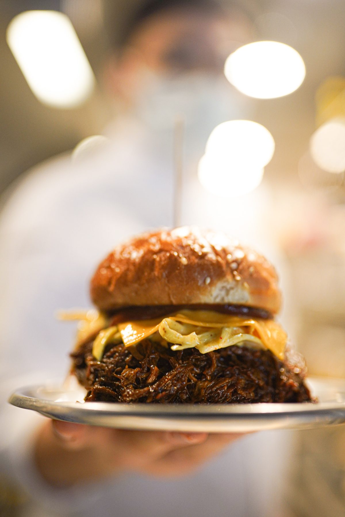
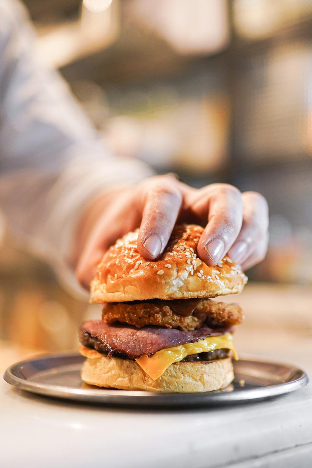
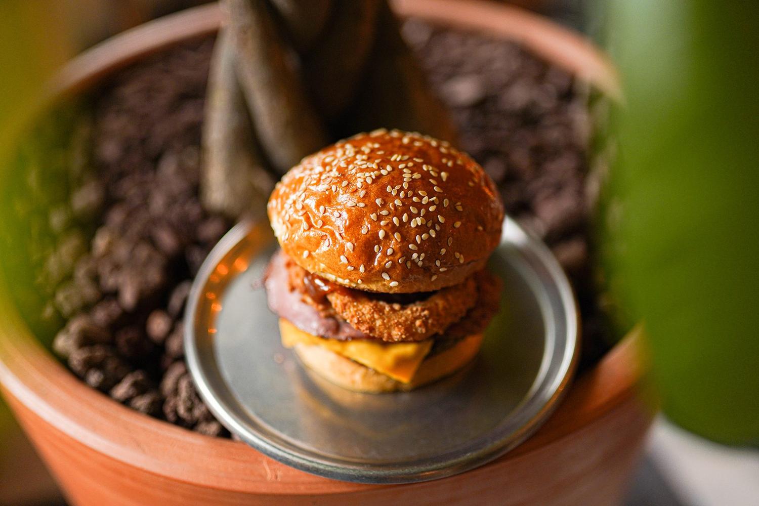
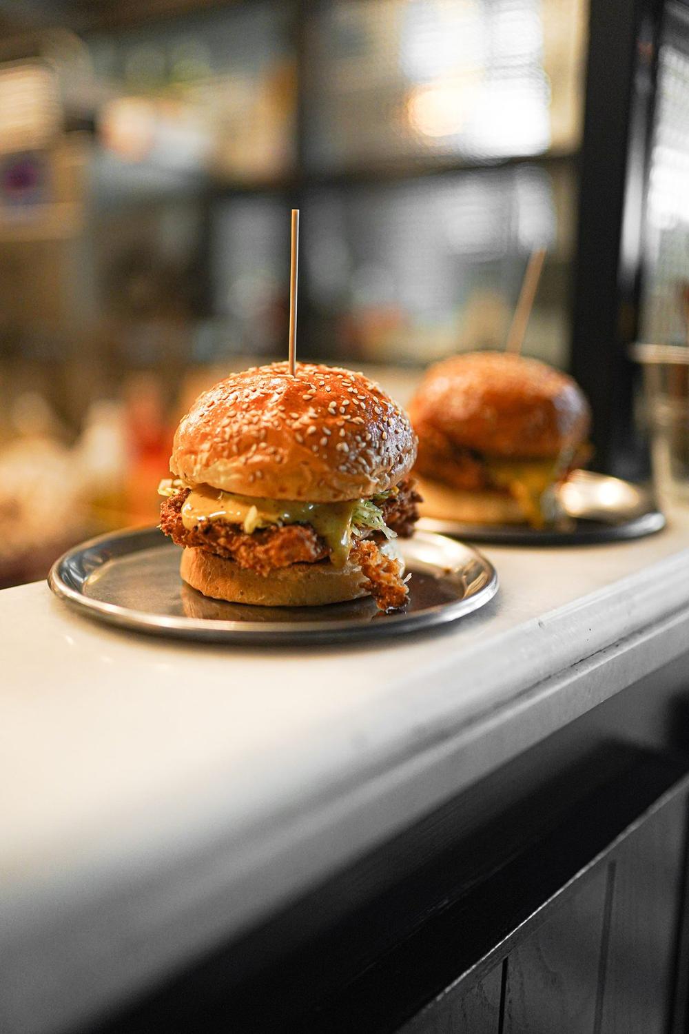
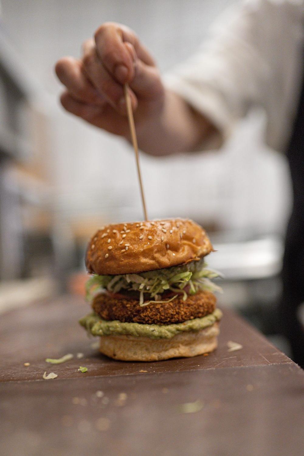
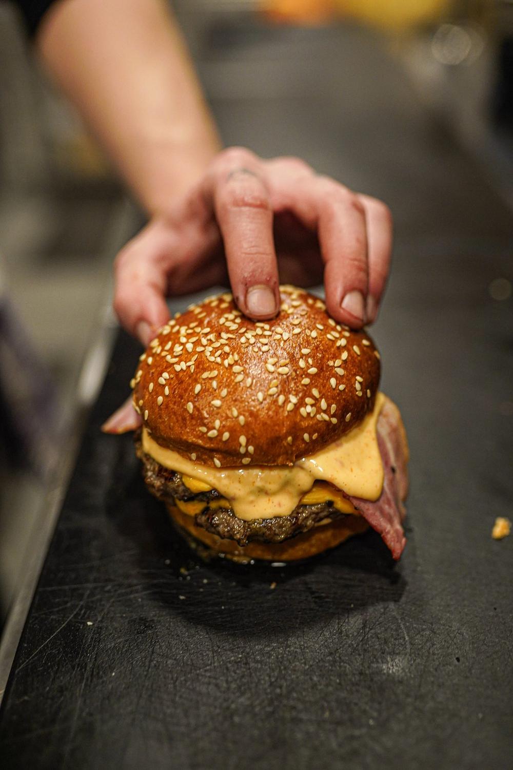
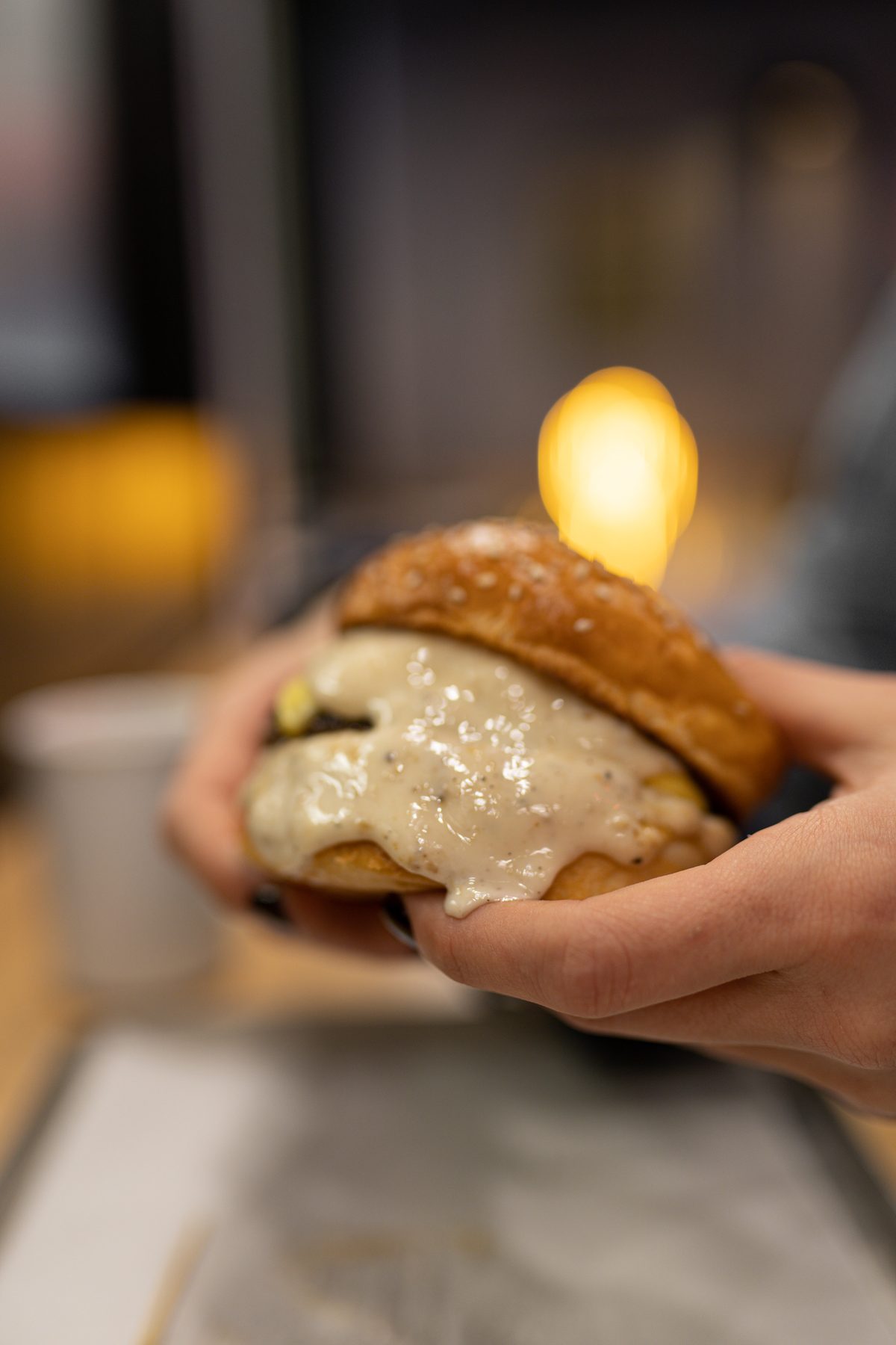
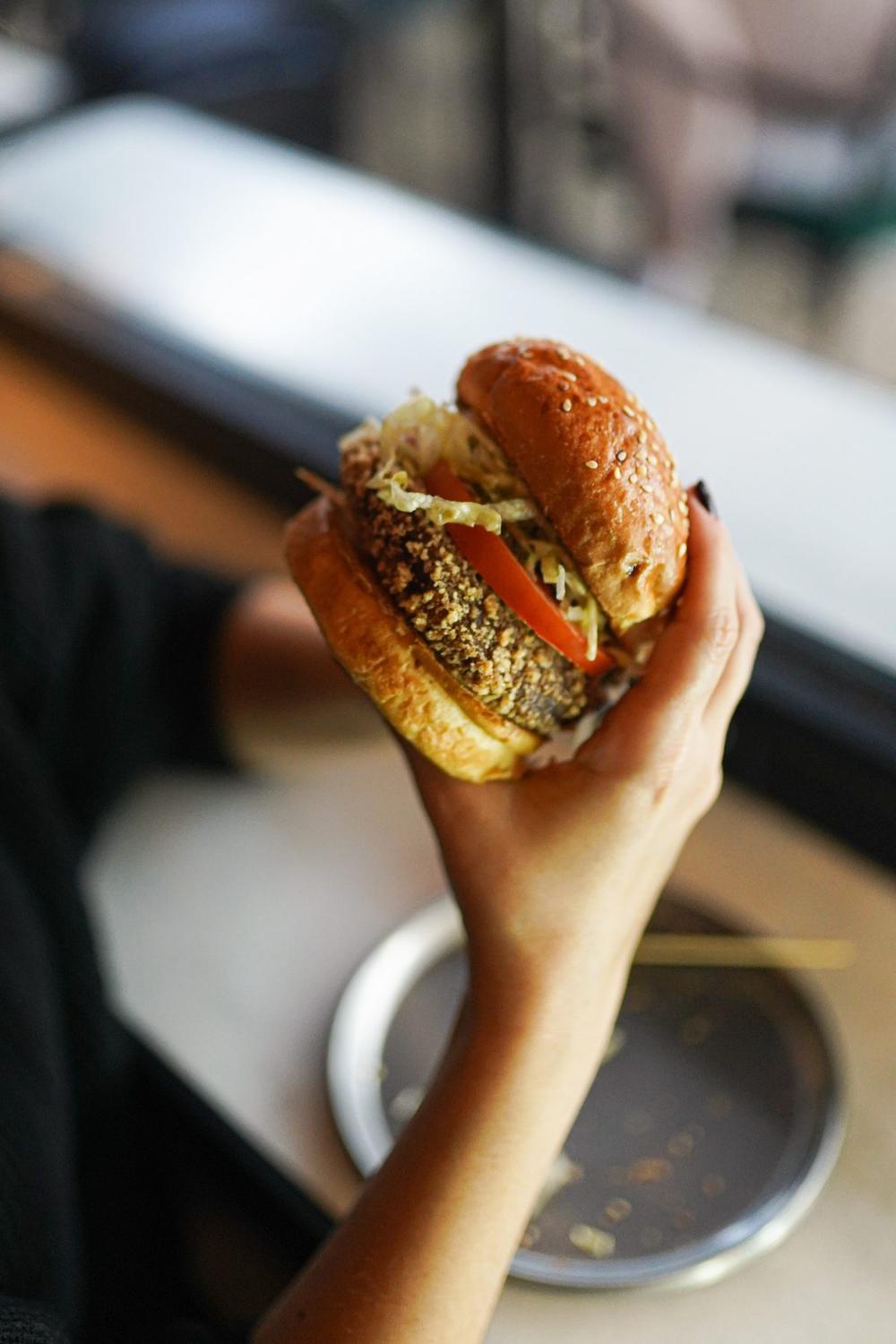
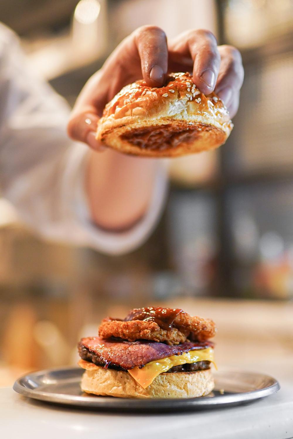
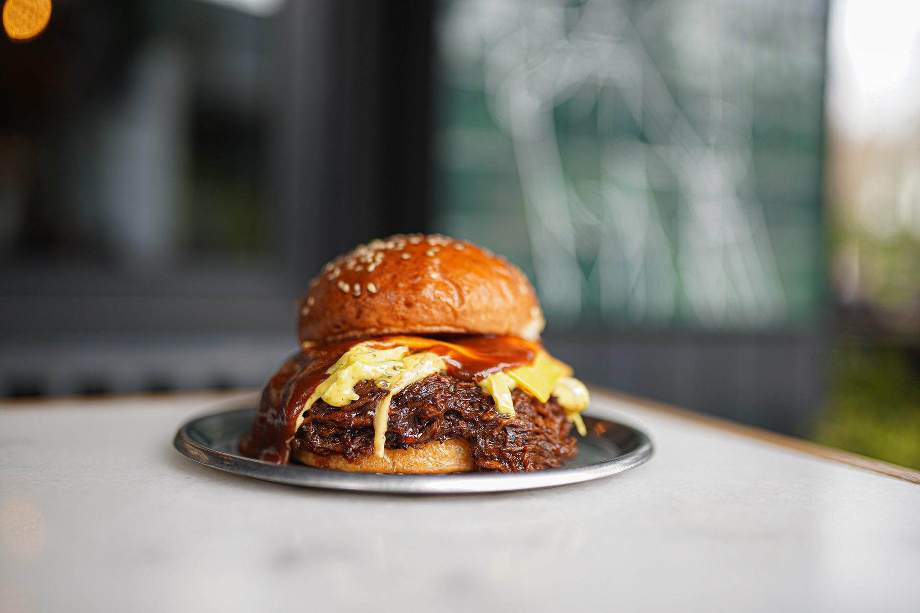
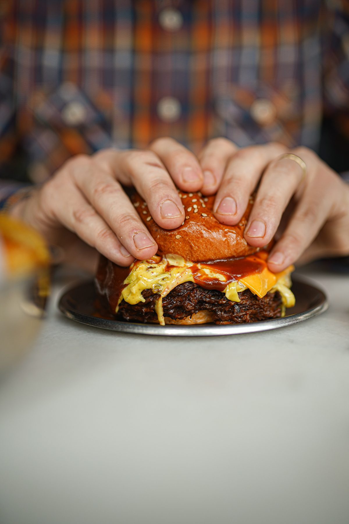
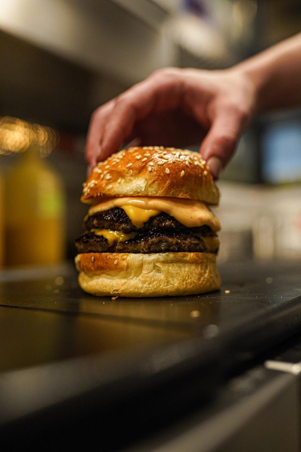
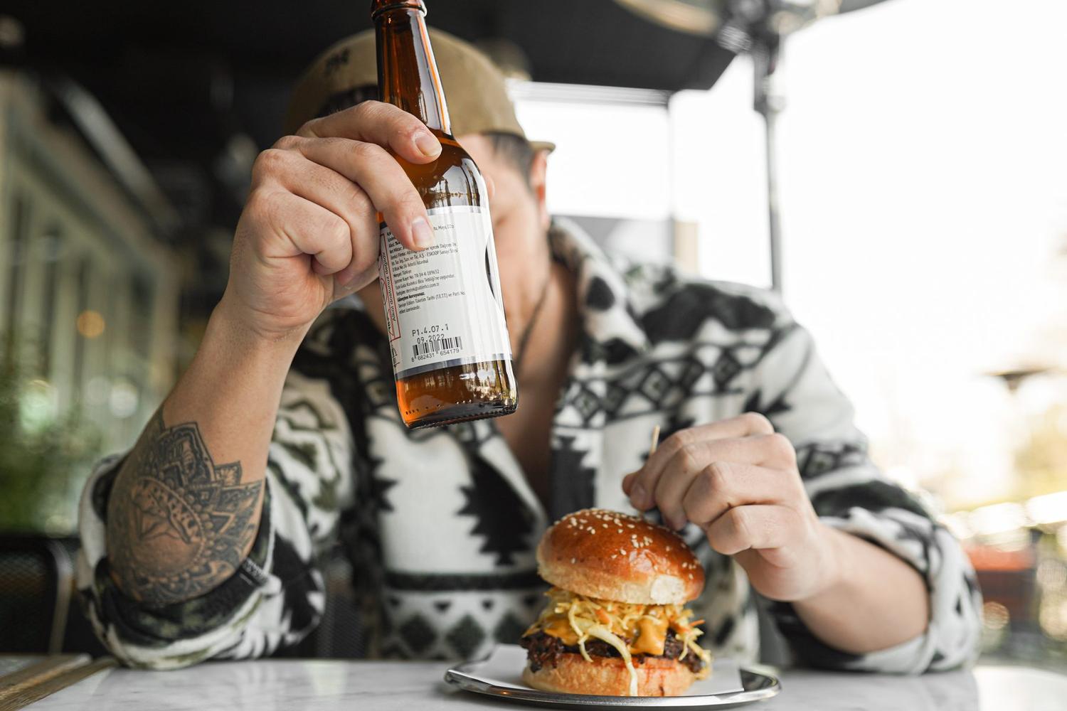
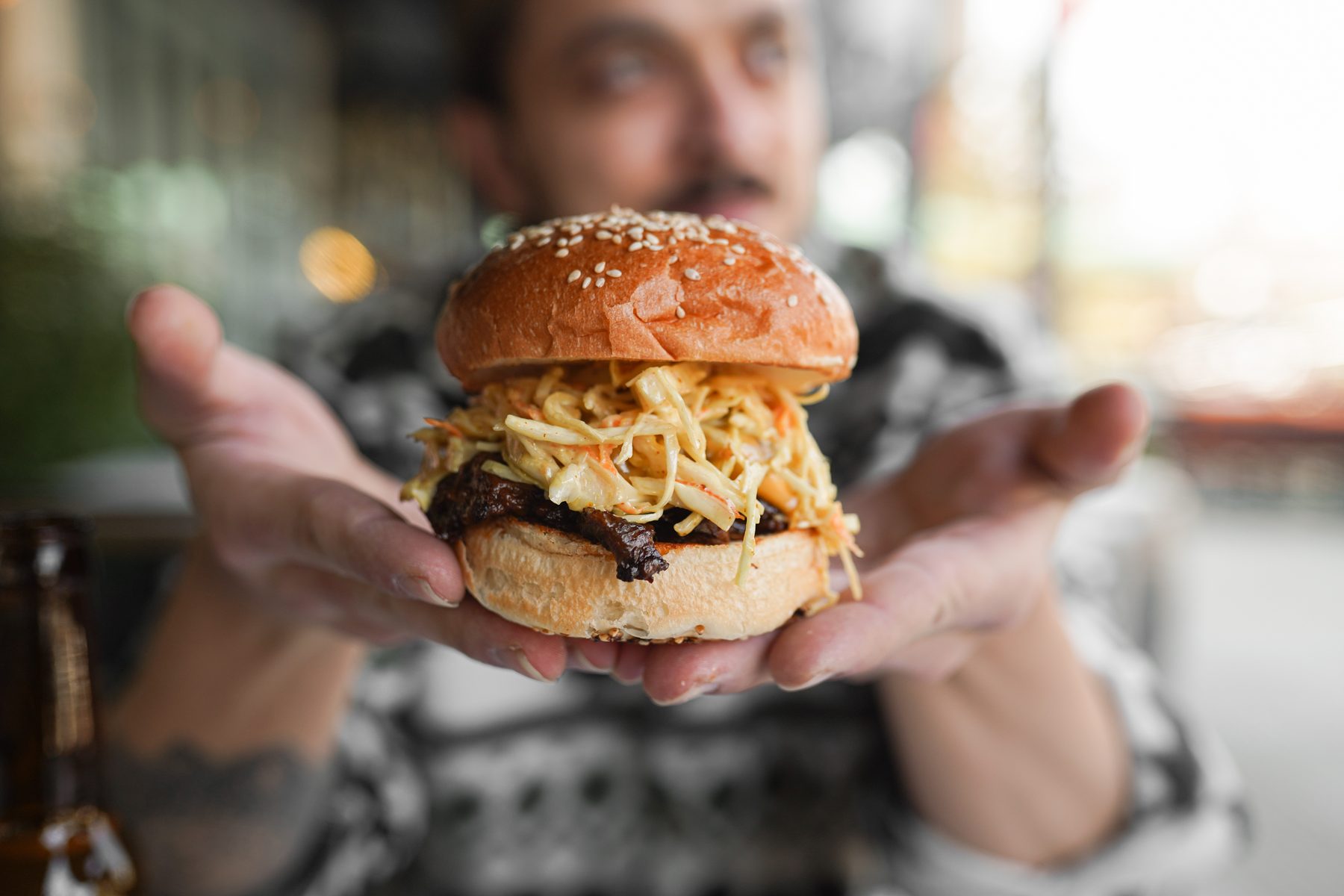
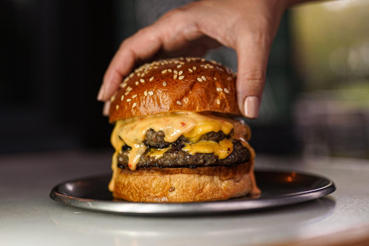
That layer-by-layer build in "The Ultimate Burger Build" looks innocent, but three backup burgers wait on set: one hero, one lighting stand-in, one for the bite frame. Cheese goes matte in 30 seconds, bun steam is gone in two minutes. Everything is rehearsed with the cold stand-in first; the hero product arrives last — shutter open, hands ready.
A single shoot is a sprint, a brand partnership is a marathon — you set your pace accordingly.
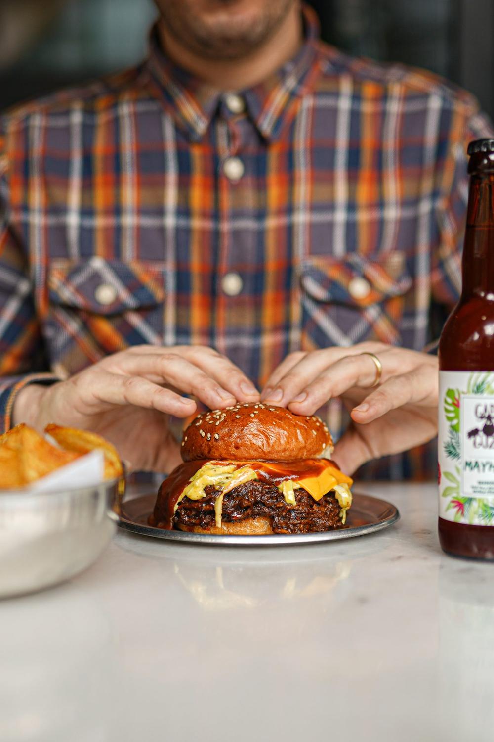
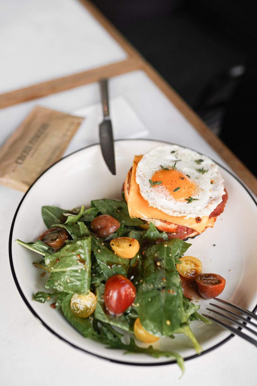
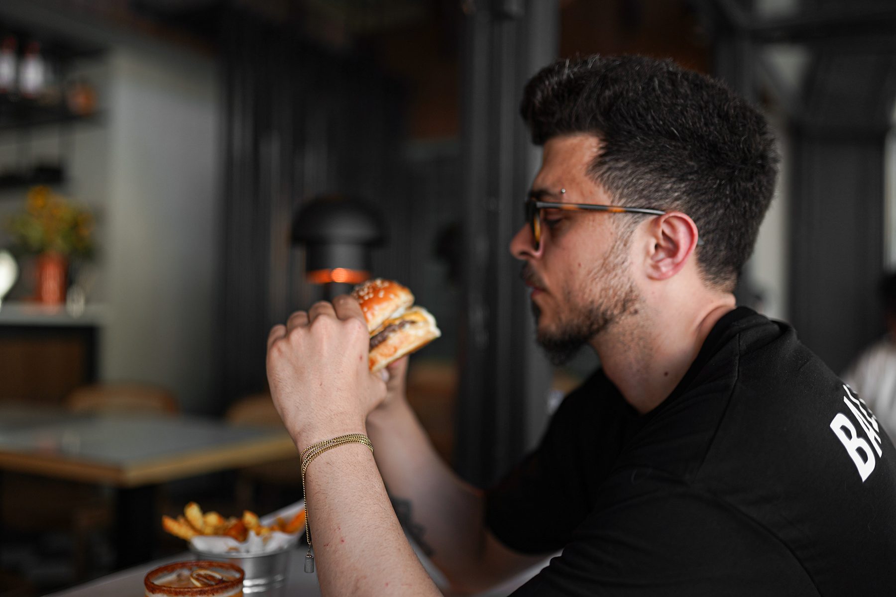
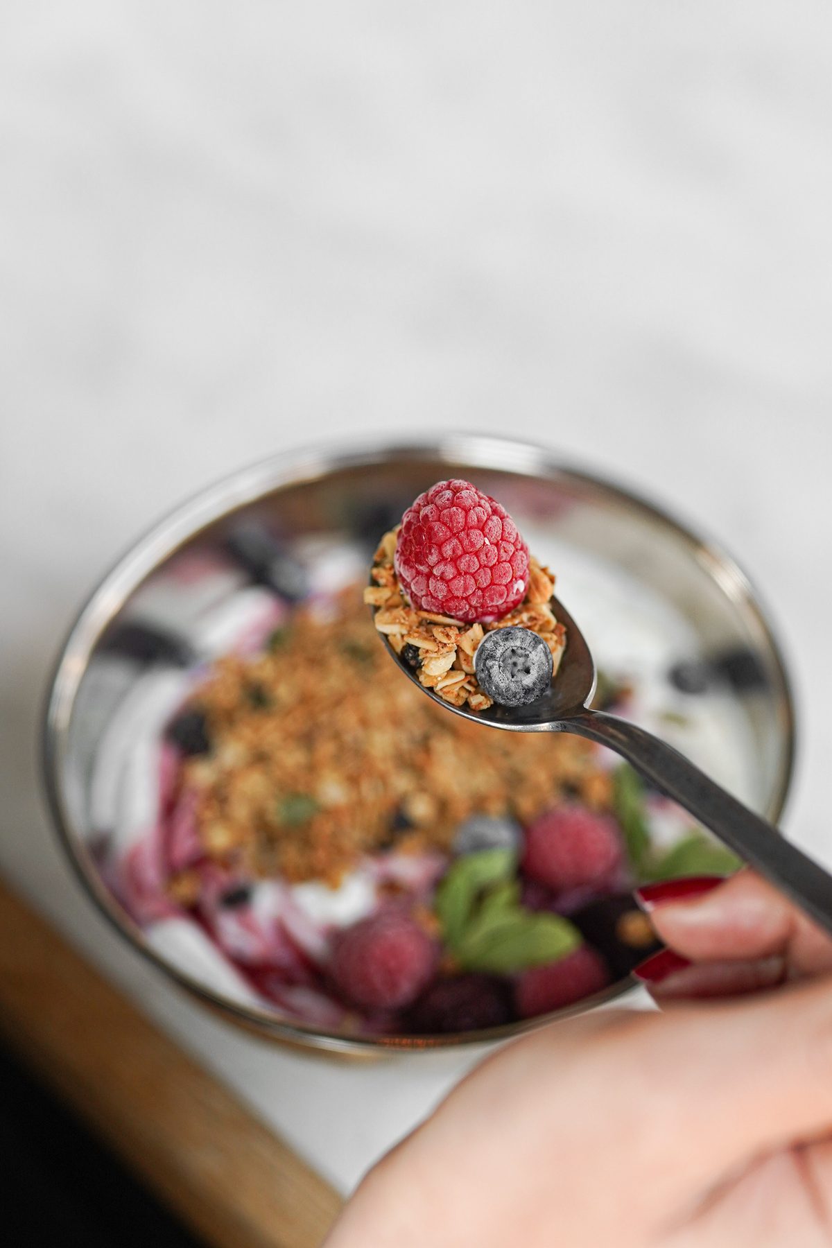
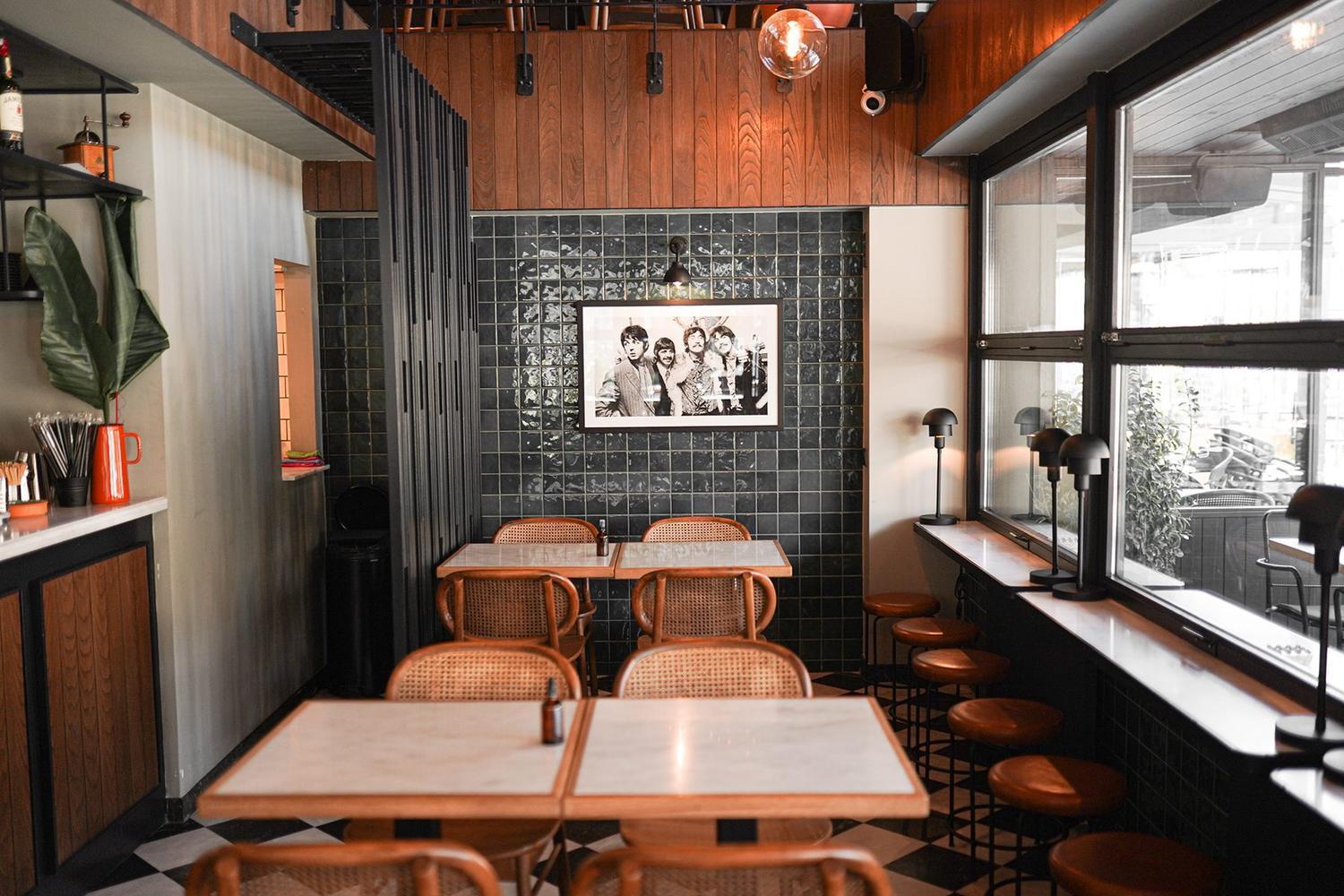
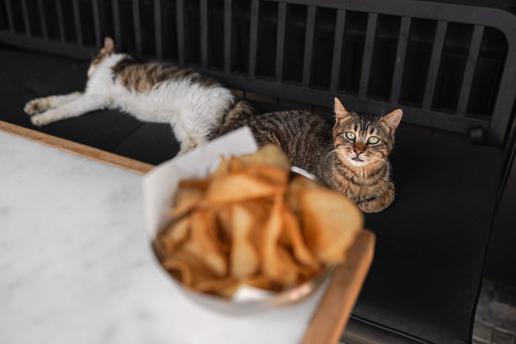
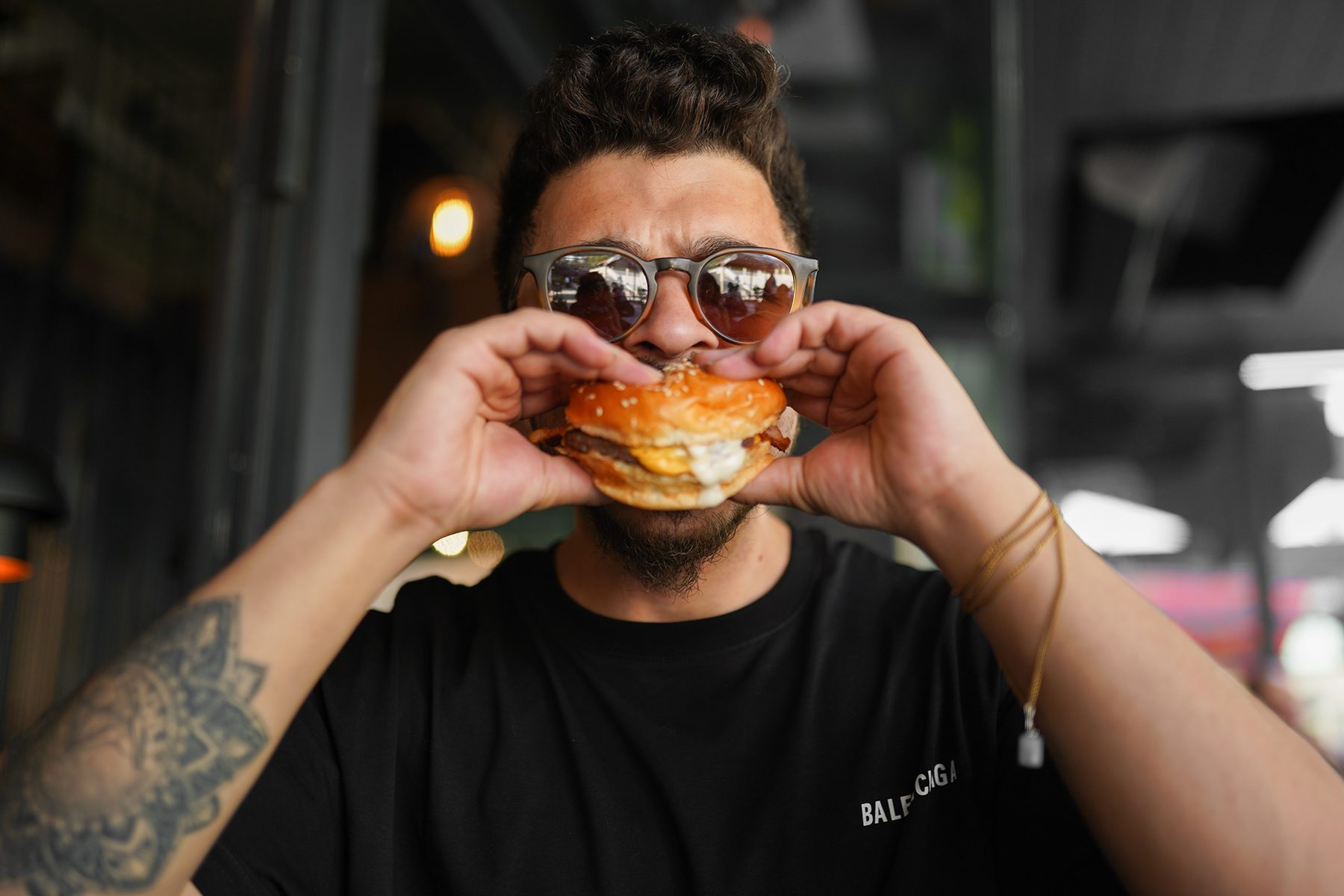
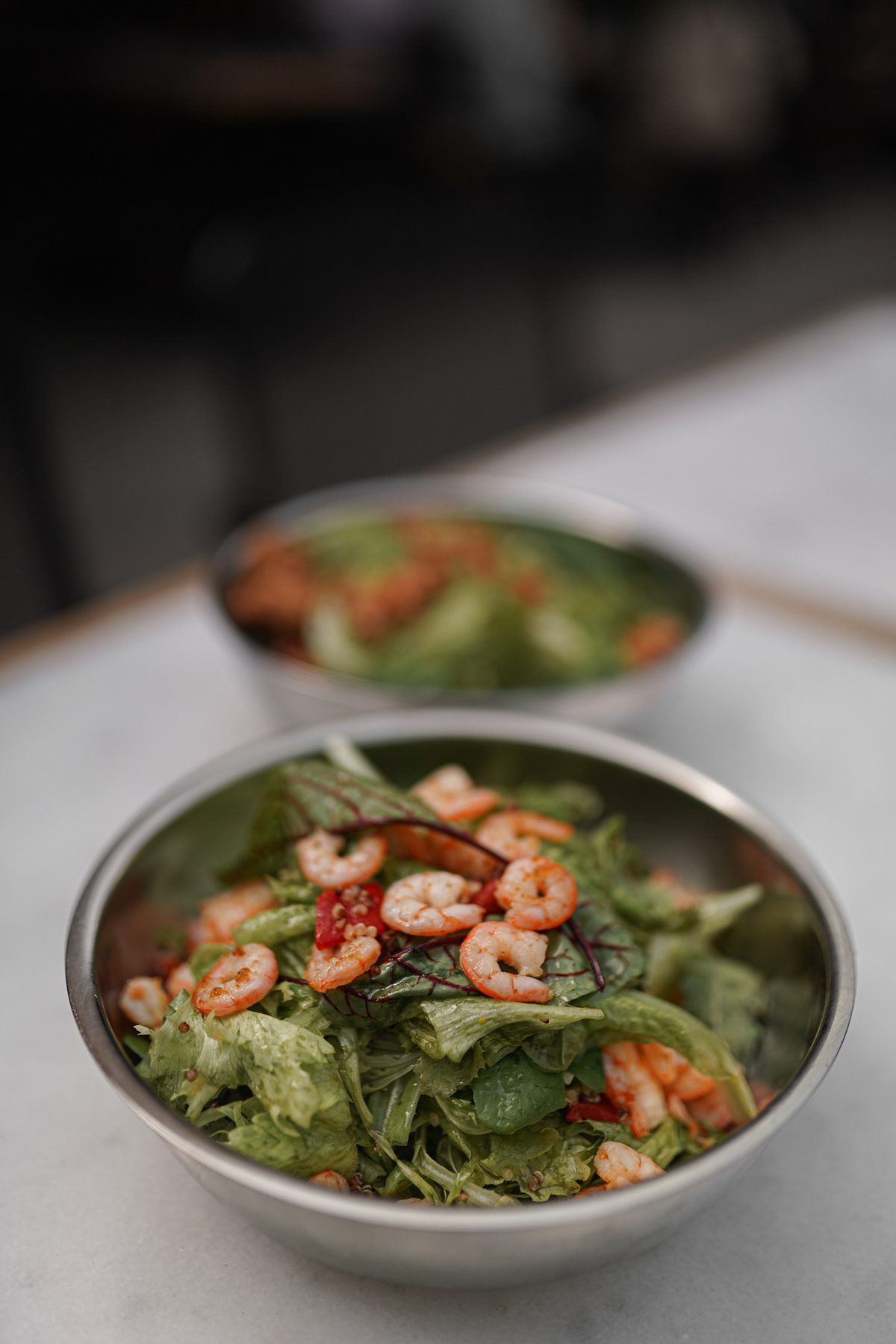
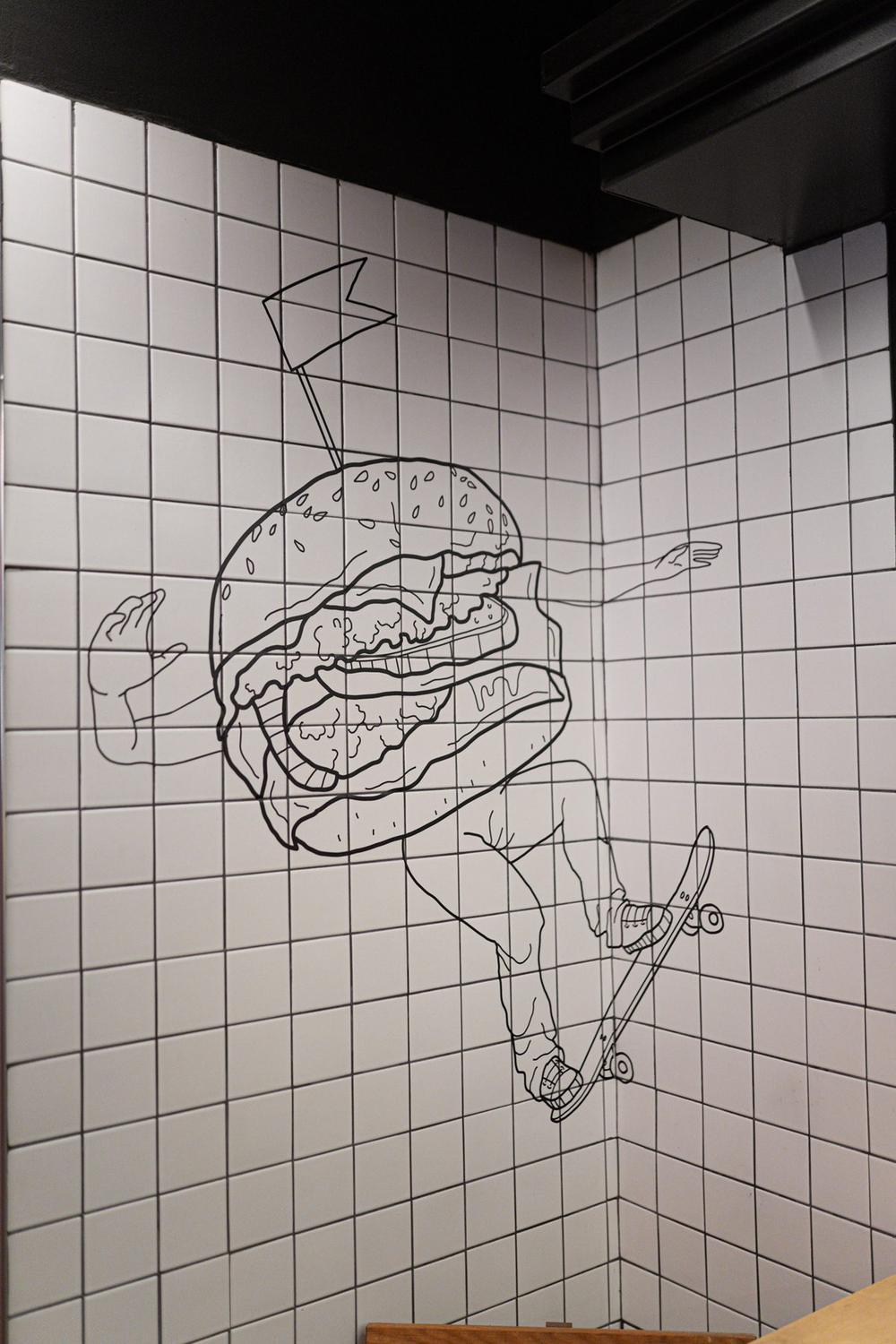
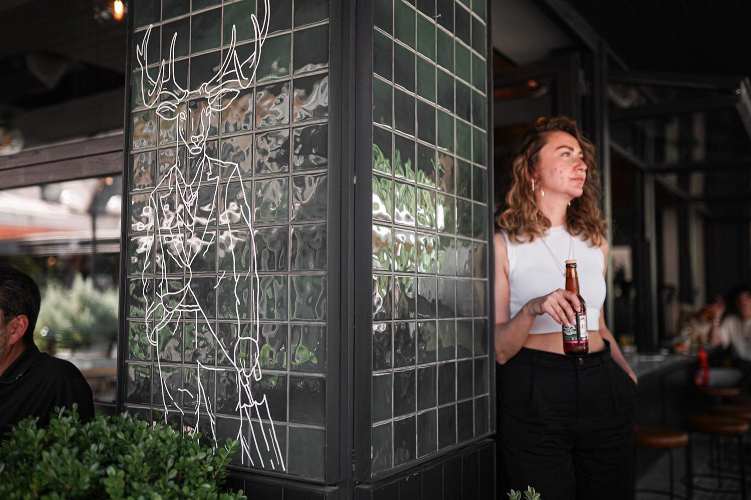
The results speak: a reels series with hundreds of thousands of views, and a brand whose identity stayed consistent over the years. The CrossFingers case is my portfolio's example of "growing with a brand" — and the hundred-plus frames on this page are that marathon's milestones.
Films From the Set
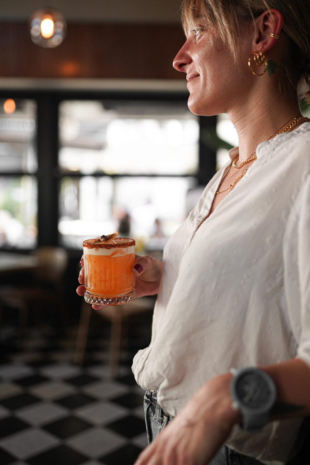
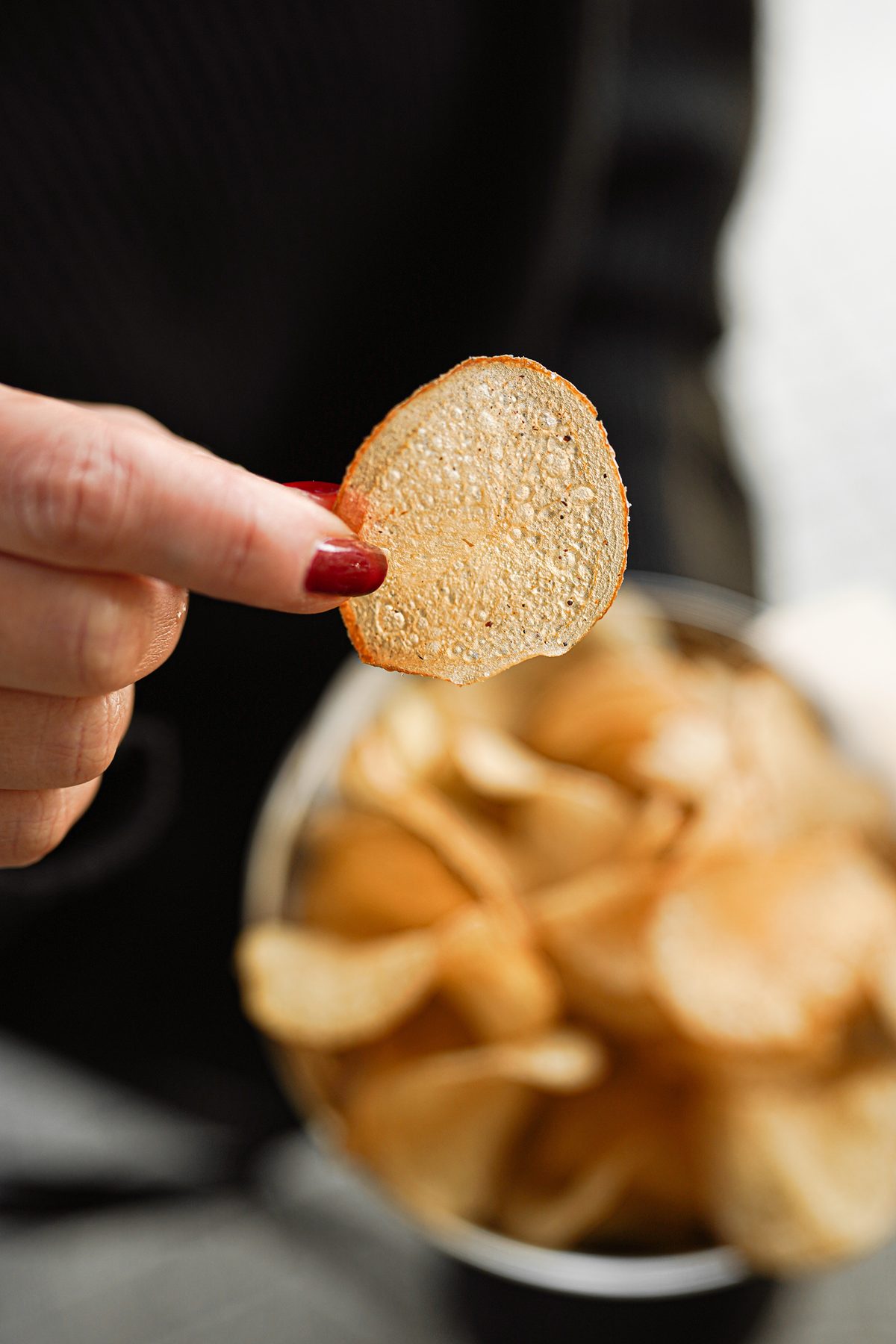
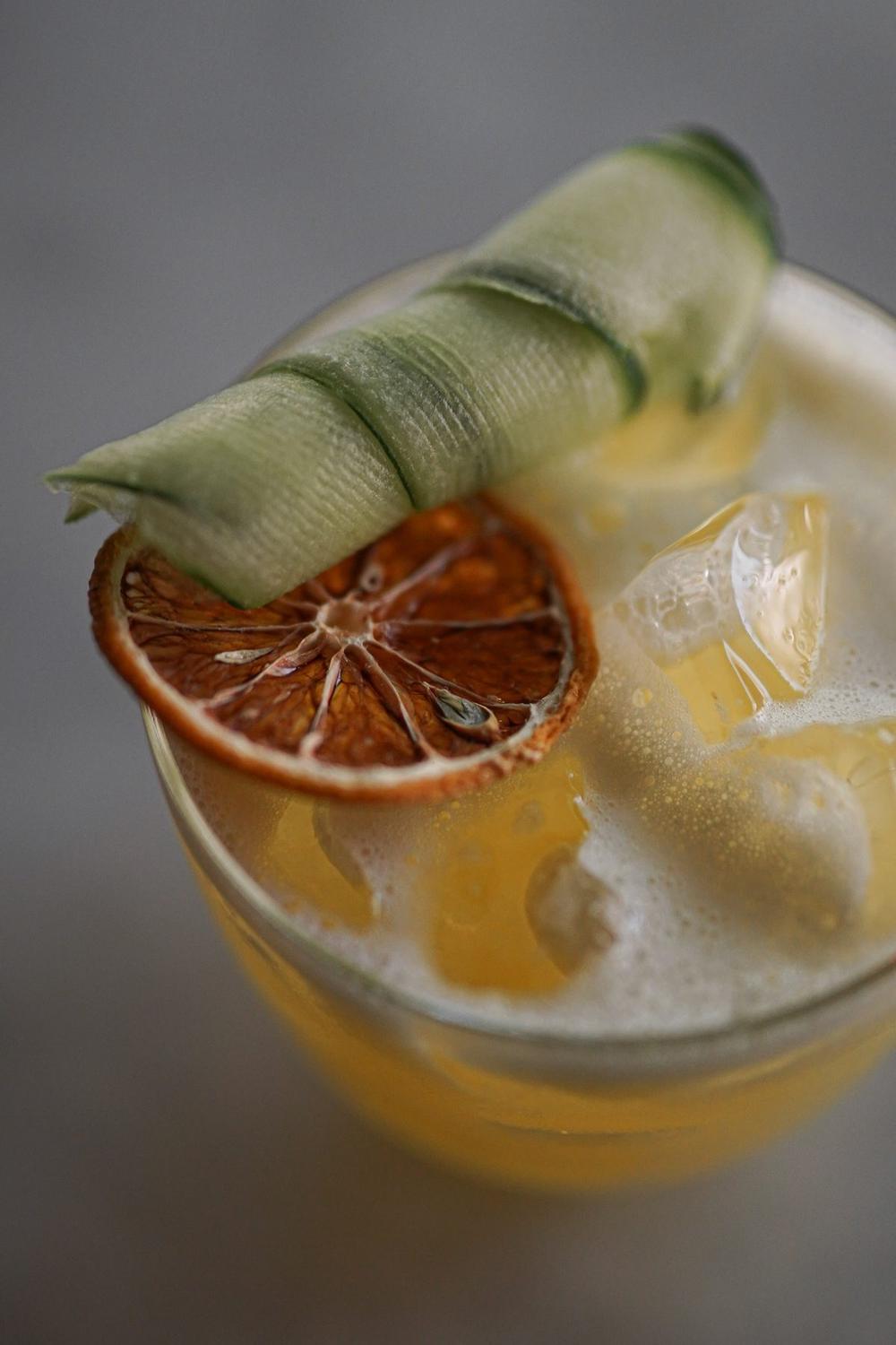
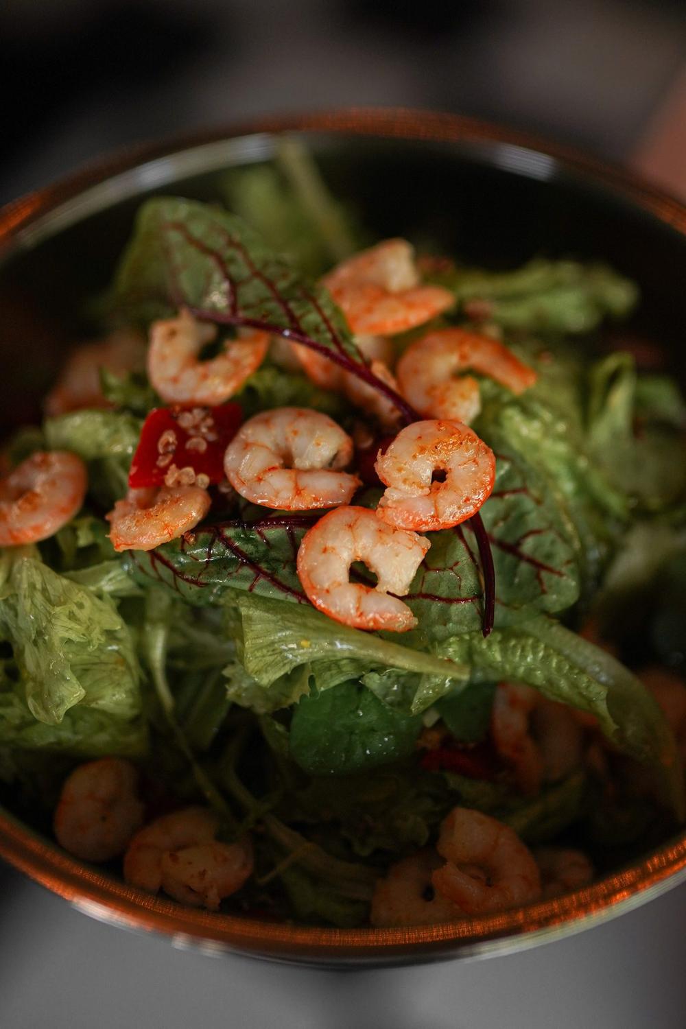
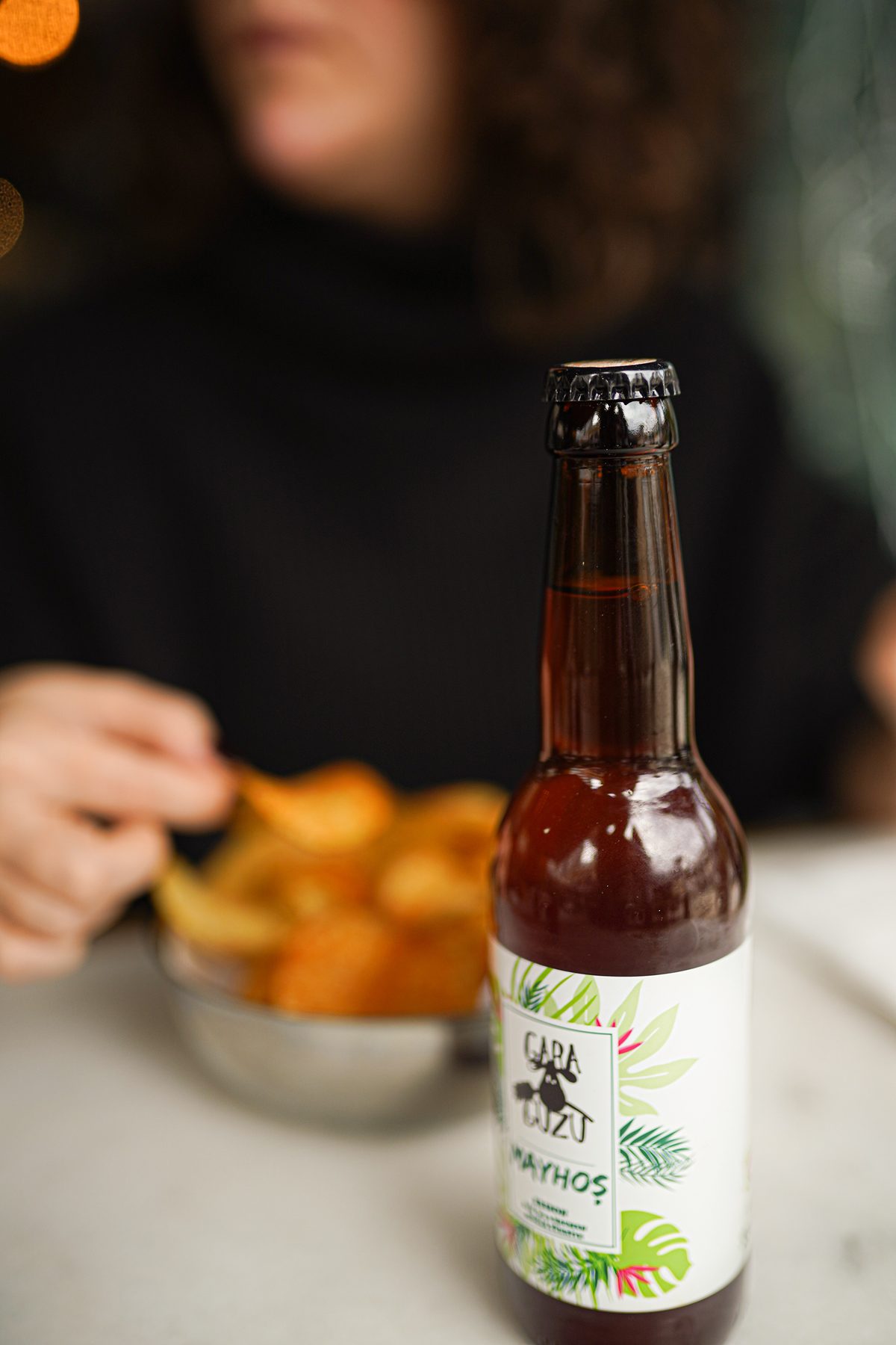
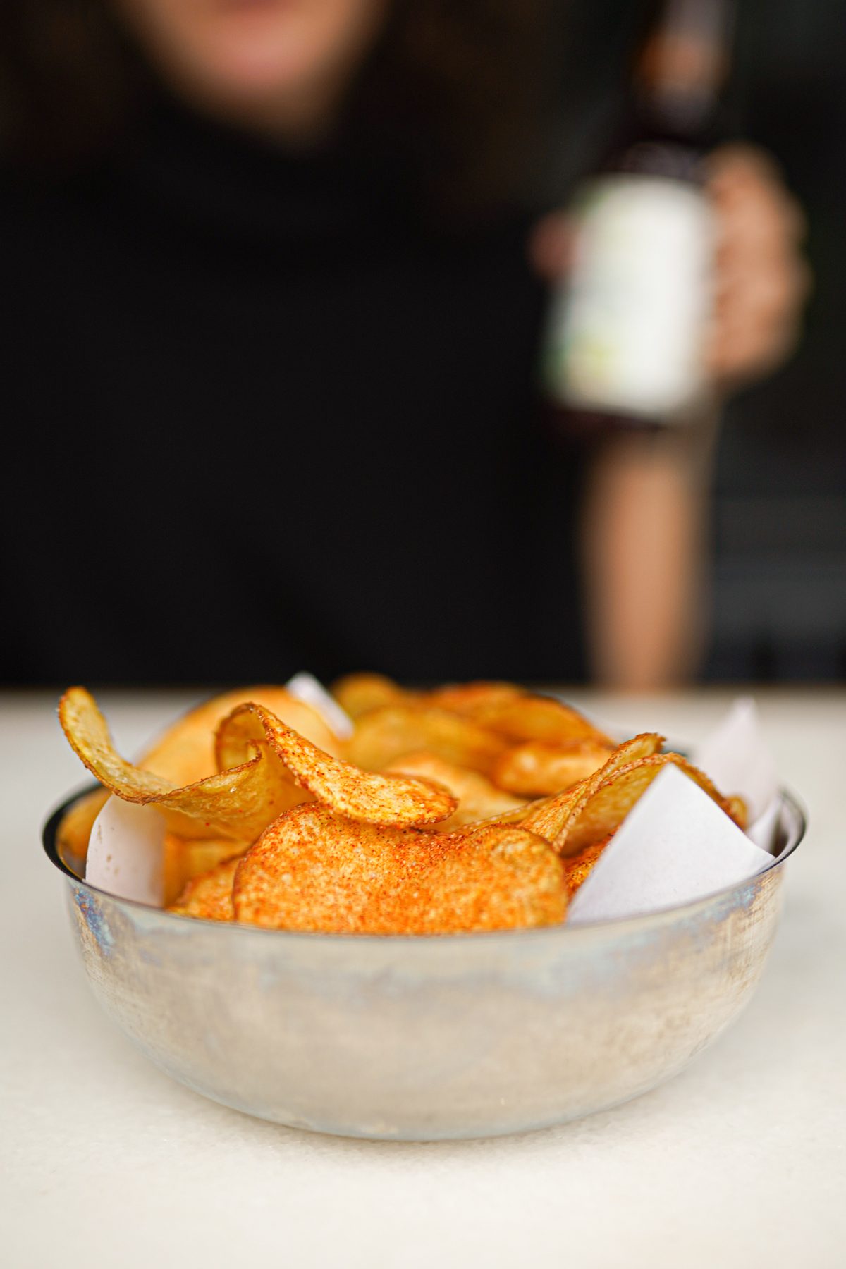
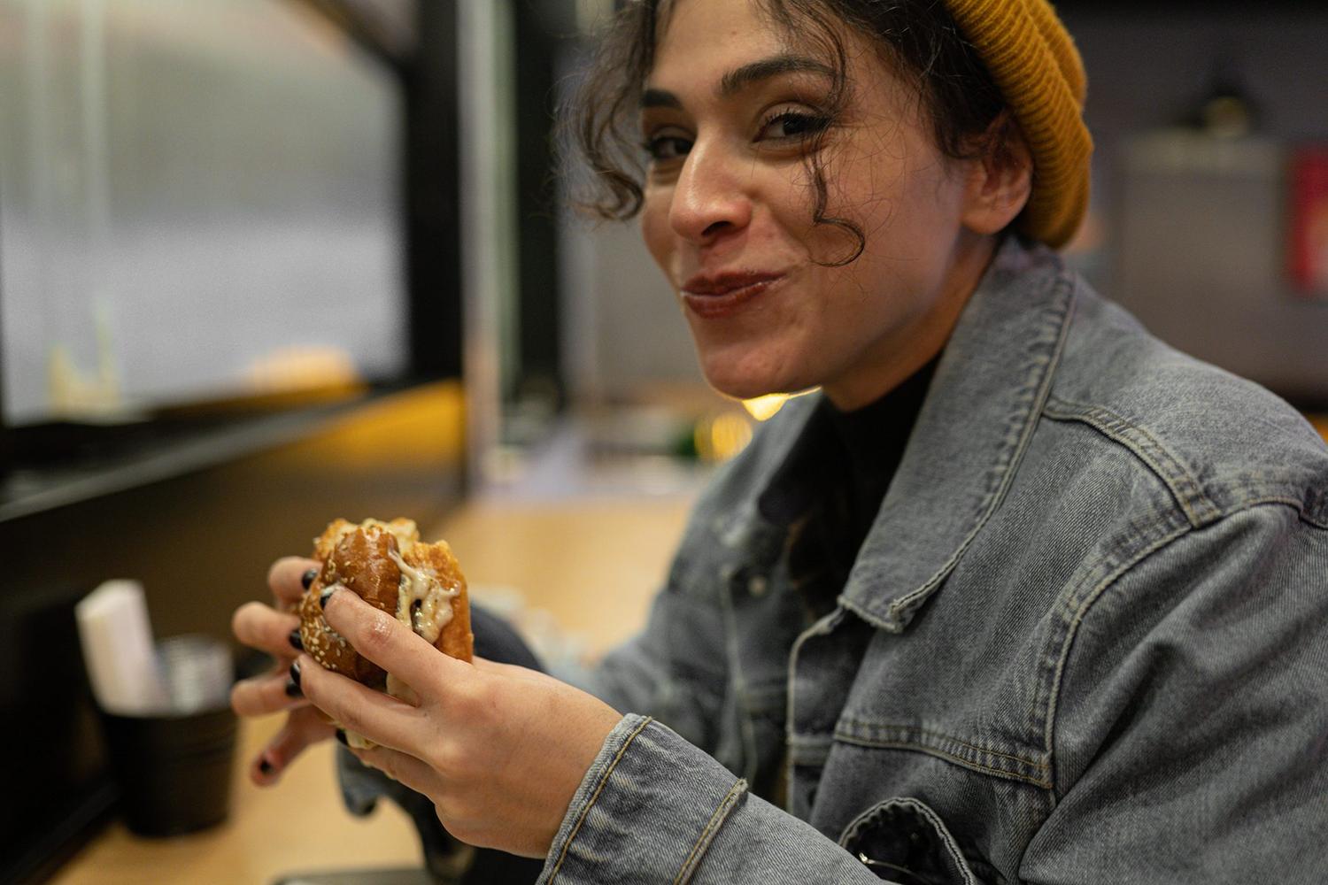
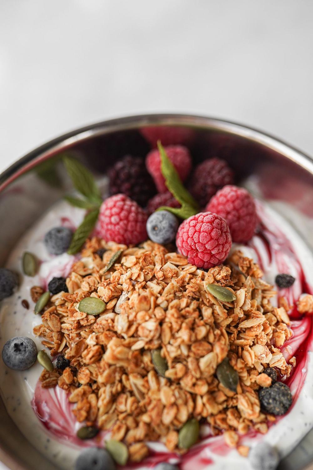
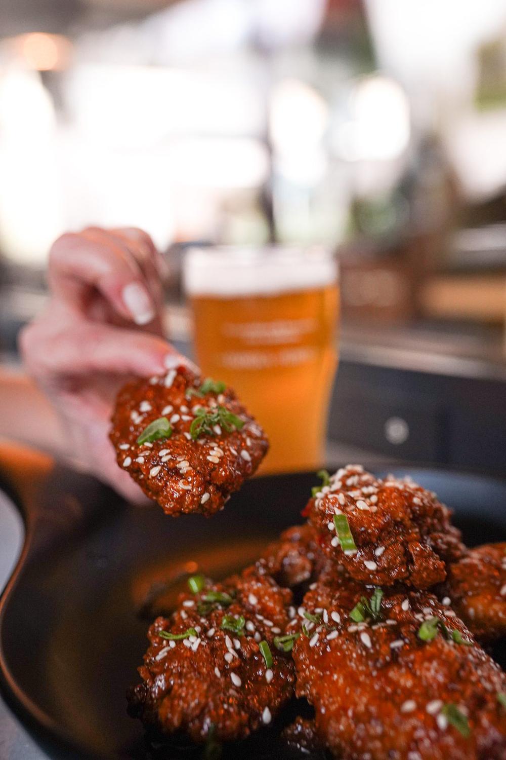
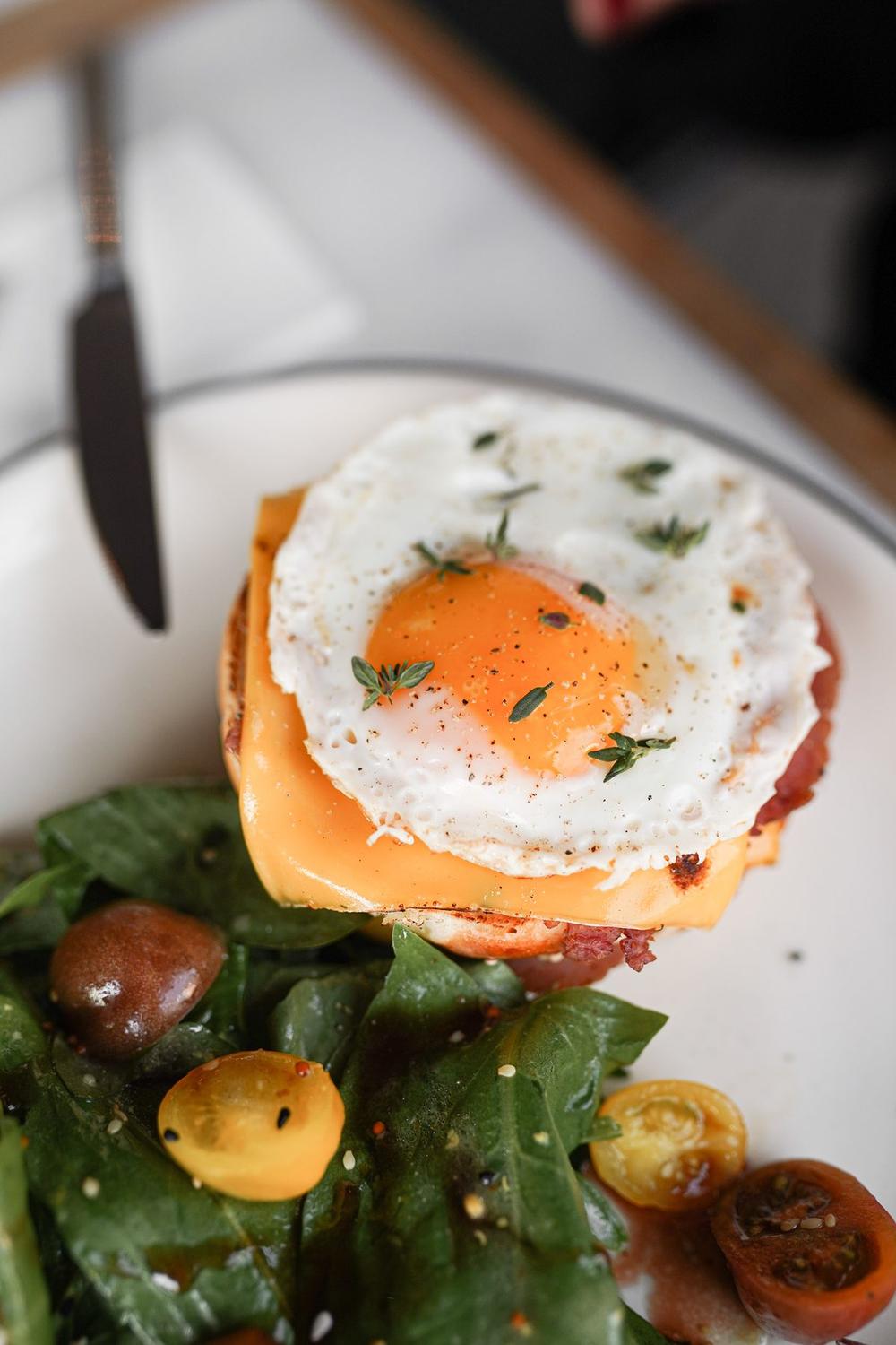
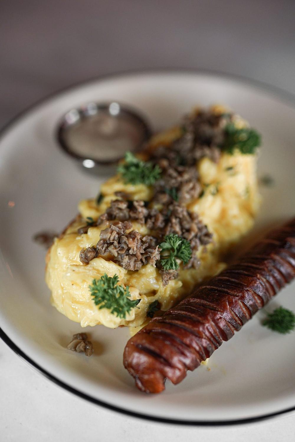
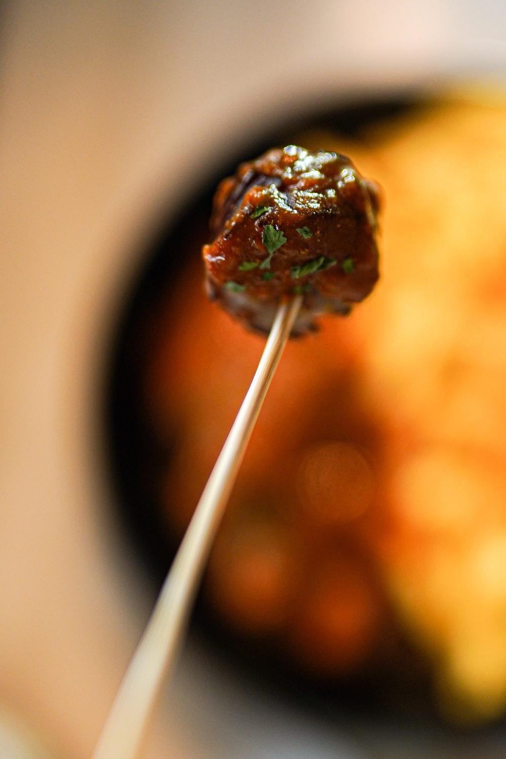
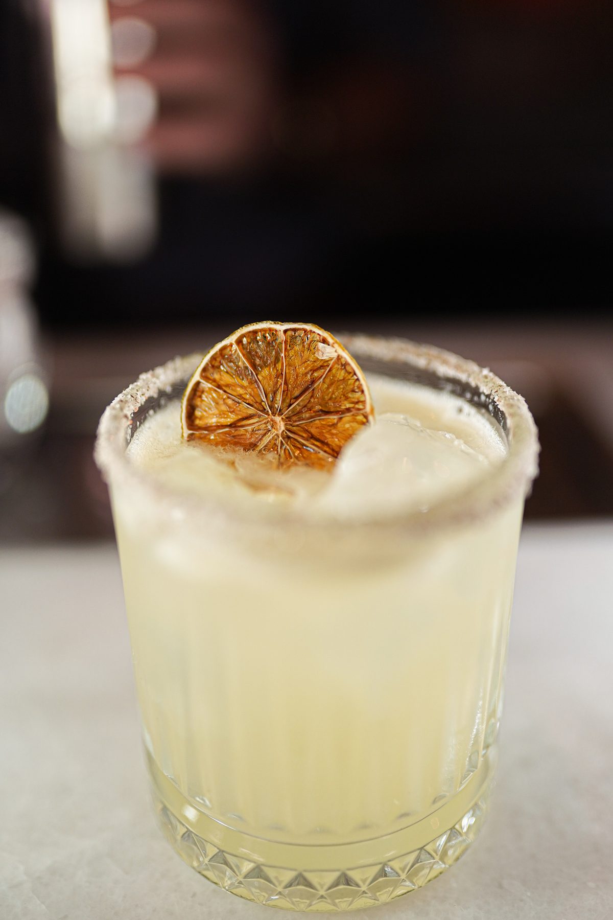
Frames
Let's create for your brand too.
A campaign, a menu shoot or a full brand identity — tell me about your project and I'll reply within 24 hours.
Get in Touch